All posts by Monica.Ahedor

Mies van der Rohe – The Edith Farnsworth House

Photo taken from: https://www.google.com/imgres?imgurl=https%3A%2F%2Fupload.wikimedia.org%2Fwikipedia%2Fcommons%2F0%2F0b%2FFarnsworth_House_by_Mies_Van_Der_Rohe_-_exterior-8.jpg&imgrefurl=https%3A%2F%2Fen.wikipedia.org%2Fwiki%2FFarnsworth_House&tbnid=e7AlqDUlePcSyM&vet=12ahUKEwjoj6mAkav0AhUUyKwKHU5JA7oQMygAegUIARCnAQ..i&docid=Exf3M6qO5YiqIM&w=5456&h=3638&q=The%20Edith%20Farnsworth%20House&client=firefox-b-1-d&ved=2ahUKEwjoj6mAkav0AhUUyKwKHU5JA7oQMygAegUIARCnAQ
Photo taken from: https://www.google.com/imgres?imgurl=https%3A%2F%2Fnthp-savingplaces.s3.amazonaws.com%2F2015%2F11%2F24%2F19%2F09%2F57%2F661%2FFarnsworth-carousel-3.jpg&imgrefurl=https%3A%2F%2Fsavingplaces.org%2Ffarnsworth-house&tbnid=4z11bLN0r02LaM&vet=12ahUKEwjBh8OWkav0AhVD0KwKHfadC-wQMygJegUIARC7AQ..i&docid=xumu12dxEnscNM&w=320&h=180&q=The%20Edith%20Farnsworth%20House%20interior&client=firefox-b-1-d&ved=2ahUKEwjBh8OWkav0AhVD0KwKHfadC-wQMygJegUIARC7AQ

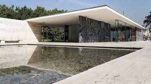
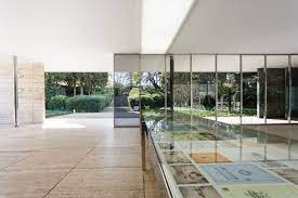
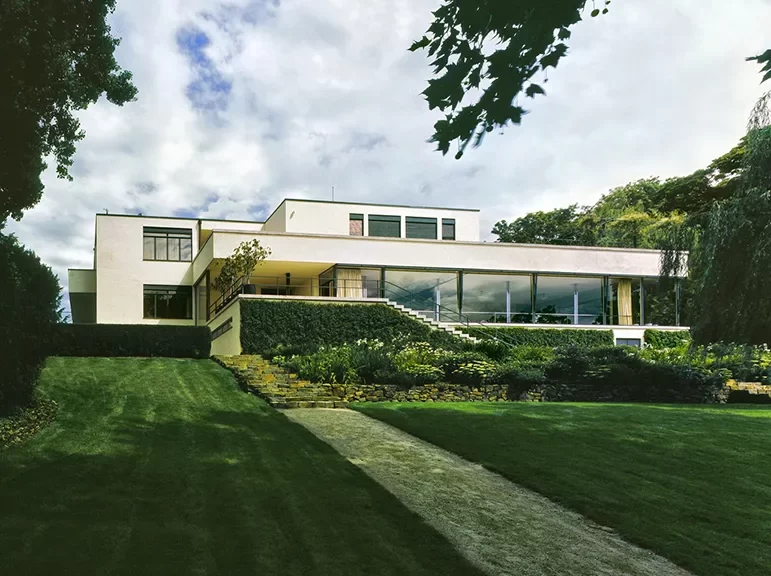
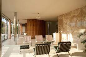
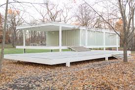
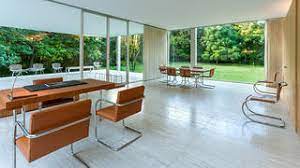
The Edith Farnsworth House is located in Plano, Illinois near Chicago and was built between 1945 and 1951. It was designed as a weekend vacation home for Dr. Edith Farnsworth, a nephrologist, musician, and poet, which is where this architectural structure gets its name. The purpose of the house is to exemplify nature. Personally, I’ve seen this architectural design in many places, I just never knew where it came from. Specifically, I see it a lot in films. It appears to be an architectural design for individuals who are wealthy, and this may be because of who the original client was. Dr. Edith Farnsworth was a very famous and affluent doctor. Although I think that the design is very pretty, the home doesn’t really speak to me. I look at it more as an art piece rather than a home. I do not wish homes to look anything like it, even vacation homes. It appears to serve one purpose and that is to help one connect with nature, but I think it fails at its fundamental purpose which is to be a home. It does not feel homely at all. I do think that there can be a mixture of architecture that helps individuals connect with nature but also provides a nice safe place to call home and this doesn’t really do that. It just feels like it’s a showpiece. Overall though, I think the design is very beautiful. I would absolutely want to vacation in it just for the experience, but I’m not entirely sure if I would enjoy it very much. It does appear to reach its overall goal which is to connect people with nature, and this is done in a very unique and nontraditional way. It emulsifies individuals in the woods and shows the beauty and cruelty of nature (as seen in the floodings). What is ironic, however, is that although the home is meant to allow one to appreciate nature, it ultimately does cause a lot of harm to the planet due to its design (mainly windows) that are not energy efficient.

Mies van der Rohe – The Barcelona Pavilion

Photo taken from: https://www.google.com/imgres?imgurl=https%3A%2F%2Fychef.files.bbci.co.uk%2F976x549%2Fp01hcfhx.jpg&imgrefurl=https%3A%2F%2Fwww.bbc.com%2Fculture%2Farticle%2F20130924-less-is-more-a-design-classic&tbnid=t472sDIQ9o-EoM&vet=12ahUKEwjdn8rLj6v0AhXJfqwKHXKaBt0QMygBegUIARDVAQ..i&docid=nS1ufKZWbCE4JM&w=976&h=549&q=The%20Barcelona%20Pavilion&client=firefox-b-1-d&ved=2ahUKEwjdn8rLj6v0AhXJfqwKHXKaBt0QMygBegUIARDVAQ
Photo taken from: https://www.google.com/imgres?imgurl=https%3A%2F%2Fimages.adsttc.com%2Fmedia%2Fimages%2F5e6b%2F912b%2Fb357%2F653d%2Fd300%2F00fd%2Flarge_jpg%2F21_Re-enactment_Foto_Anna_Mas.jpg%3F1584107791&imgrefurl=https%3A%2F%2Fwww.archdaily.com%2F935480%2Fartistic-intervention-re-enactment-highlights-lilly-reichs-works-in-the-barcelona-pavilion&tbnid=NDMBeVAZMSFVcM&vet=12ahUKEwjo_rqIkKv0AhVI2qwKHZQtA2MQMygCegUIARCzAQ..i&docid=fvLU3iO2lbYdLM&w=2000&h=1333&q=The%20Barcelona%20Pavilion%20interior&client=firefox-b-1-d&ved=2ahUKEwjo_rqIkKv0AhVI2qwKHZQtA2MQMygCegUIARCzAQ

Personally, I’m not much of a fan of Mies van der Rohe’s work. A lot of it looks too plain and cold for my liking. The Barcelona Pavilion has a lot of cool elements, but overall, I’m not much of a fan. The house is definitely a masterpiece, but it just doesn’t appeal to me. The outside of the house looks really cool. It has a lot of marble walls, similar to the Villa Tugendhat, that contrast really works well with the white ceilings. Furthermore, there is a lot of window space, which I like. Finally, I like the pool of water outside of the house. It adds a nice, sophisticated touch to the home. Besides that, I don’t really care for the house. It looks too plain and boring and not like a home. It feels like a place where a bunch of rich people have mid-life crises, instead of a place to relax at the end of a day. The home just feels so empty and lonely. It feels depressing. Yea, it’d be cool to stay in it for a couple of days because it’s something new, and I like new experiences, but I wouldn’t buy it or design anything like it. There are many ways to make a home look inviting and friendly without keeping to traditional styles, but I don’t like this. I also feel like this home doesn’t really fit into Mies van der Rohe’s theme of connecting individuals with nature very well. The tall walls make the place feel cut off and isolated, kind of like a very fancy prison. I will say though that I do also like how the house is a light color. I think I would dislike the home even more if the walls and ceilings were dark. Overall though, the home is really not my cup of tea. I wouldn’t want to live there because it looks like a really uptight office. It doesn’t feel like a home and, therefore, it’s a pass for me.

Mies van der Rohe – Villa Tugendhat

Ludwig Mies van der Rohe, Libor Teplý · Villa Tugendhat · Divisare
Photo taken from: https://www.google.com/url?sa=i&url=https%3A%2F%2Fdivisare.com%2Fprojects%2F276366-ludwig-mies-van-der-rohe-libor-teply-villa-tugendhat&psig=AOvVaw3UBHPBBenkuicM-I4A93pz&ust=1637640866751000&source=images&cd=vfe&ved=0CAsQjRxqFwoTCKjFse-Nq_QCFQAAAAAdAAAAABAD
Photo taken from: https://www.google.com/imgres?imgurl=https%3A%2F%2Fimg.archilovers.com%2Fstory%2F9052c76c-3ddb-4d02-8f57-5cd352b030eb.png&imgrefurl=https%3A%2F%2Fwww.archilovers.com%2Fstories%2F27352%2Ficonic-houses-villa-tugendhat.html&tbnid=Q_1WpvVZ7HINcM&vet=12ahUKEwiWzYCTjqv0AhUNLq0KHb_yAs0QMygBegUIARCyAQ..i&docid=Li-keZxWtAqjCM&w=766&h=508&q=Villa%20Tugendhat&hl=en&client=firefox-b-1-d&ved=2ahUKEwiWzYCTjqv0AhUNLq0KHb_yAs0QMygBegUIARCyAQ

Mies van der Rohe was an architect who very much liked simple designs and that is seen in this house. The Villa Tugendhat looks absolutely beautiful on the outside. It’s simple and yet sophisticated at the same time. It’s elegant and yet humble. I personally love window space and this home has plenty of it. Furthermore, the white exterior adds a nice calming touch to the overall house. The garden also exemplifies the beauty of nature. It’s positioned in a way that doesn’t diminish the beauty of the home, but it also doesn’t look tacky like traditional gardens in some homes. It adds an important element to it. The interior of the house is where things take a turn. It is very nice, don’t get me wrong, but I think it looks ugly compared to the outside. It is very simple and predominately white with a splash here and there of color. It looks bare, empty, cold, and uninviting. The two things that I do like are the natural lighting and the amazing views of nature. However, the inside of the house looks like an art museum rather than a home. It needs more life and less white. Similar to the Edith Farnsworth house, it feels like an art piece rather than a home. I do think that Mies van der Rohe did a good job of connecting individuals to the nature around the house, but I don’t feel like that objective should surpass the objective of making a home feel like a home. The only thing that makes this house feel like a home is the exterior, and even that isn’t really done well. Ultimately, it is very nice though. It looks pretty on the outside, but the inside is just too bland for me. I wish it had more life.

Mies van der Rohe – The Seagram Building

Seagram Building | building, New York City, New York, United States |  Britannica
Photo taken from: https://www.google.com/imgres?imgurl=https%3A%2F%2Fcdn.britannica.com%2F77%2F42277-050-98669F2B%2FSeagram-Building-Ludwig-Mies-van-der-Rohe.jpg&imgrefurl=https%3A%2F%2Fwww.britannica.com%2Ftopic%2FSeagram-Building&tbnid=b4YBIrDPM__slM&vet=12ahUKEwjX4aqtjKv0AhVN_qwKHa0AAlUQMygpegUIARChAg..i&docid=FmwAD7BXD62omM&w=852&h=1572&q=the%20seagram%20building&client=firefox-b-1-d&ved=2ahUKEwjX4aqtjKv0AhVN_qwKHa0AAlUQMygpegUIARChAg
Philip Johnson and the making of the Seagram Building | Architecture |  Agenda | Phaidon
Photo taken from: https://www.google.com/url?sa=i&url=https%3A%2F%2Fca.phaidon.com%2Fagenda%2Farchitecture%2Farticles%2F2020%2Fmarch%2F11%2Fphilip-johnson-and-the-making-of-the-seagram-building%2F&psig=AOvVaw1BkoG0t4axXrH0xi4ZIafB&ust=1637640545622000&source=images&cd=vfe&ved=0CAsQjRxqFwoTCJjM3cyMq_QCFQAAAAAdAAAAABAD

The Seagram Building is another one of Mies van der Rohe’s architecture. It was built in 1957 and is located in New York City. The building is bronze and has dark glass, which I’m not really a fan of. It reaches the sky at 38 stories high and has a granite plaza at the ground that looks very beautiful. Furthermore, it capitalizes on having very geometric shapes. This is in contrast to older skyscrapers that usually had a lot of detail and artwork, were not necessarily geometric, and were vibrant in color. I think what is ironic is that although Mies really attempted to make his architecture as simple as possible, there are clearly elements that are used to enhance its beauty. For example, the fake structural frames that are seen within the skyscraper serve little purpose, and yet they are there to “reveal” the frame of the building. This is contradictory to his style because they are unnecessary, and yet all the necessary to depict a minimalist building. Overall, I think this building is a little bland. I do appreciate the simplest style, but I also believe that it really fails to capture the beauty that skyscrapers have. Yes, the Seagram plaza does a good job of highlighting the pure magnificence of a building just being a skyscraper, but I think it fails to add other elements that make a skyscraper art rather than a box of metal. I do, however, think that the plaza is a really nice element. Cities oftentimes can feel really cramped and having the plaza is a way for people to not feel as compact.

Caesar’s Palace, Las Vegas

In Las Vegas, there’s a lot of really cool buildings. While visiting the city, I remember seeing Caesar’s Palace. I’m not entirely sure why I remember Caesar’s Palace the most. There were tons of other hotels and attractions that, honestly, piqued my interest more, but I think I remember it the most because of how popular that specific hotel is. Nonetheless, it was still very unique and neat. The building had a Roman architecture theme. The outside looked like Roman structures with many many pillars and arches. There were a lot of domes and statues as well. It really was a cool depiction of Roman culture. On the first floor of the building inside, there was a bunch of casinos and shops. If I recall correctly, the inside had a lot of gold where the casinos were located and a ceiling painted like the sky where the shops were at. Furthermore, there were a lot of statues and monuments. I remember seeing a play performed by animated characters of some important historical Roman event. I didn’t really enjoy seeing it all that much because I couldn’t see what was happening due to being so short.

The purpose of Caesar’s Palace is evidently to provide entertainment. There were no windows on the bottom floor and I presume it is so people are not aware of how much time they’ve spent in the building. Therefore, they stay longer and spend more money. It was extremely large and very easy to get lost. I went to only one tower and spent about two hours simply looking around. It was definitely a grand structure meant just for amusement. There were tons of drunk people and individuals laughing, having a good time. All of this made me not very interested in the place. Yea, the building was very cool, but besides wasting money and getting drunk there really wasn’t any other purpose for it. Caesar’s Palace just appeared as a place to throw one’s life away and considering how many people have lost their life’s savings due to gambling, I think my assumption is correct.

Now, I’m not saying that the building is ugly, it just didn’t appeal to me. While there, I found myself wanting to leave and get back to the “real world” even though I would still be stuck in Vegas. It was just too shut out and isolated from everything else occurring, and I did not like that. The palace was extremely beautiful and had amazing architecture, but I just didn’t really care for it or for the city, if I’m being honest. The meaning of the hotel was just so superficial. There were tons of other activities besides shops and casinos such as a fountain that were cool, but those things were only interesting for so long. Maybe the problem is that I need to learn to let go and have some fun, but Caesar’s Palace was just, dare I say it, boring.

Anaheim Convention Center, California

The Anaheim Convention Center is huge. When I went to see the Anaheim Convention Center, located in Anaheim California, it was a largest building that I had ever seen. I went to visit Anaheim during my freshman year of high school for a school conference. Honestly, I really just wanted to go to Anaheim just to visit Disneyland, but in the process of going to see the theme park, I had to go to the convention center and all of its events that were hosted. When I first saw it, I was in awe. It was humongous. There are thousands of people in the building and yet we only occupied a small portion of it. To put in perspective how big it is, it’s currently the tenth-largest convention center in America, YouTube holds many of its conferences there, and it’s over a million square feet.

The outside of the Anaheim Convention Center looks really cool. It’s a glass building with a lot of cool monuments and artwork on the outside. The inside, to be completely honest, is pretty lackluster. Part of the convention center just looks like a big warehouse that has no end. There is really nothing special about it. Other parts of the convention center were a little prettier. You could tell they were modernized to make the building look more appealing, but it still didn’t have that “wow” factor that some other buildings do. I don’t really hold it against the convention center because its function isn’t entirely to look grand. It’s to hold huge gatherings and it does that quite well.

Coming from Oklahoma and having been to previous conferences, I knew that convention centers could be huge, but I didn’t know they could be THAT huge. I remember while walking through the building, it seemed like every time when I thought I had mastered the layout, there was a different section for me to explore. It was so huge that I didn’t even see the entire building. Despite not knowing where I was, I had a lot of fun. I met a lot of different people from different parts of the world and learned a lot of new things. My favorite memory was probably the opening ceremony which had different artists and bands. I was with all my friends and that was a great experience. 

I think what was the cherry on top of the convention center was how it was located around a lot of other cool activities. As I previously said, I only traveled to Anaheim so that I could go to Disneyland and the convention center was within walking distance from it. It also had a lot of cool shops and restaurants that really showcased the beauty of California. I was able to walk around the area with my friends and we were able to see many things that you just can’t find here in Oklahoma. I think all of this made the building extremely memorable to me. Since then, I’ve been to larger convention centers, but I still remember Anaheim simply because it was the first very large convention center I had been to and because, frankly, it was the best. It wasn’t just a convention center that made it so cool, it was the environment and its purpose which ultimately allowed me to create a ton of memories.

Fort James, Ghana

The building still haunts me to this day. It was old with dingey white-colored walls. You could tell it was probably a beauty during its time, but it, nevertheless, was a place of tremendous sorrow. Fort James was an English trading post for African slaves and commodities. Located in Accra, it was and still is in a very populous city of Ghana. As a kid, I remember seeing the building and how scary and imposing it was on the beach. It was very out of place, in a region full of slums. It was too large and protected. In a place full of rich African culture, there was this fort evidently European overshadowing everything.

Knowing the history of the country, though, the building fits in perfectly. It was a building of oppression. Where it housed thousands of human souls and contributed to the desolation of Africa. Hundreds of years later, it still stands tall showcasing the effects that it had and still has on Ghana and Africa today. The building wreaked havoc on the region and portrays history very well. When it was initially built, it was beautiful. However, its significance only could have existed due to the dehumanization of Africans. As time went on, it changed its function from a trading post to a prison. It still served the same function of oppression. It simply just had a new name during the era of colonization. Finally, it has become a museum. A place to remember the atrocities and the history of the nation. Crumbling and deteriorating, the fort’s presence shows how the slave trade and colonization may be done, but the impacts are still felt.

I was ten at the time that I saw the building. The people who lived around the fort went about their day as if it didn’t even exist, but I just couldn’t stop looking at it. Before my uncle even explained to me the history of the fort, I already knew its purpose. It was so evident who had built the fort and for what reasons because it was so out of place and yet so in place. After explaining, my uncle asked if I wanted to go to another city in Ghana to learn more about the European slave castles, and with a blank face, I told him “no.” I couldn’t go look at more because it was disheartening to think of all the lives lost and destroyed because a group of people were different. It hit me at that moment when I was there that history indeed happened. People were ripped from their families, put in chains, and dehumanized all for greed. And I could see it all, right there in front of me. In hindsight, I probably should have taken my uncle’s offer to go look at more buildings, but I was too young to comprehend the importance of learning the hard truths of life. Now only a little older, remembering the people swimming happily in the presence of such horrific memories has taught me that you can always find joy in life; it just takes the strength to move on.

Whittier Middle School, Norman

Whittier middle school is one of the buildings that I hate. For the three years that I was forced to step foot in that building, I hated just about every minute of it. Don’t get me wrong, there were good days, but for the most part, they were bad days. I didn’t like the teachers, the students, the environment, and, yes, I hated the building. I remember every Monday morning walking through the halls with dread, looking around at a newly renovated building that didn’t provide an education equivalent to the structure. You see, the problem with the building was that it was all for show, like a Long John Silver’s commercial. The food might look remotely decent, but when you taste it, it’s absolutely putrid. The building may look somewhat pretty, but considering its purpose, it’s ugly.

The purpose or the meaning of Whittier middle school was and still is to provide adolescents an education. It had walls that were round in shape to provide “cool” classrooms. It had many windows in the newly renovated areas that most likely served the purpose of allowing kids to connect with their environment. But despite the architect’s best efforts to provide a great educational structure, the building still filled me with dismay. Now that I think about it, the building could have been state of the art, and I still believe I would have received the same emotions that I do now. It wasn’t necessarily the building that I disliked, but rather the emotions the building gave me. I was not filled with joy when I went to the building, and therefore, every time I pass by it now, I think it looks absolutely hideous. The building failed to sufficiently provide me with its one purpose: a good classroom experience. 

It didn’t make me happy. It made me sad, and that sadness has made me hate that “type” of architecture because every time I encounter a building similar to it, it reminds me of my memories and how bad they were. I guess what Whittier Middle School taught me is that a building does not get its beauty just from the material that it’s made of or its intricate design. Rather, a building gets its beauty from the impact that it has on people. Sometimes a grand building is enough to make one feel in awe, but most times it does not, nor is it always feasible to create such a structure. Thus, something magnificent is constructed when it touches the hearts of others. When it creates those fond memories.