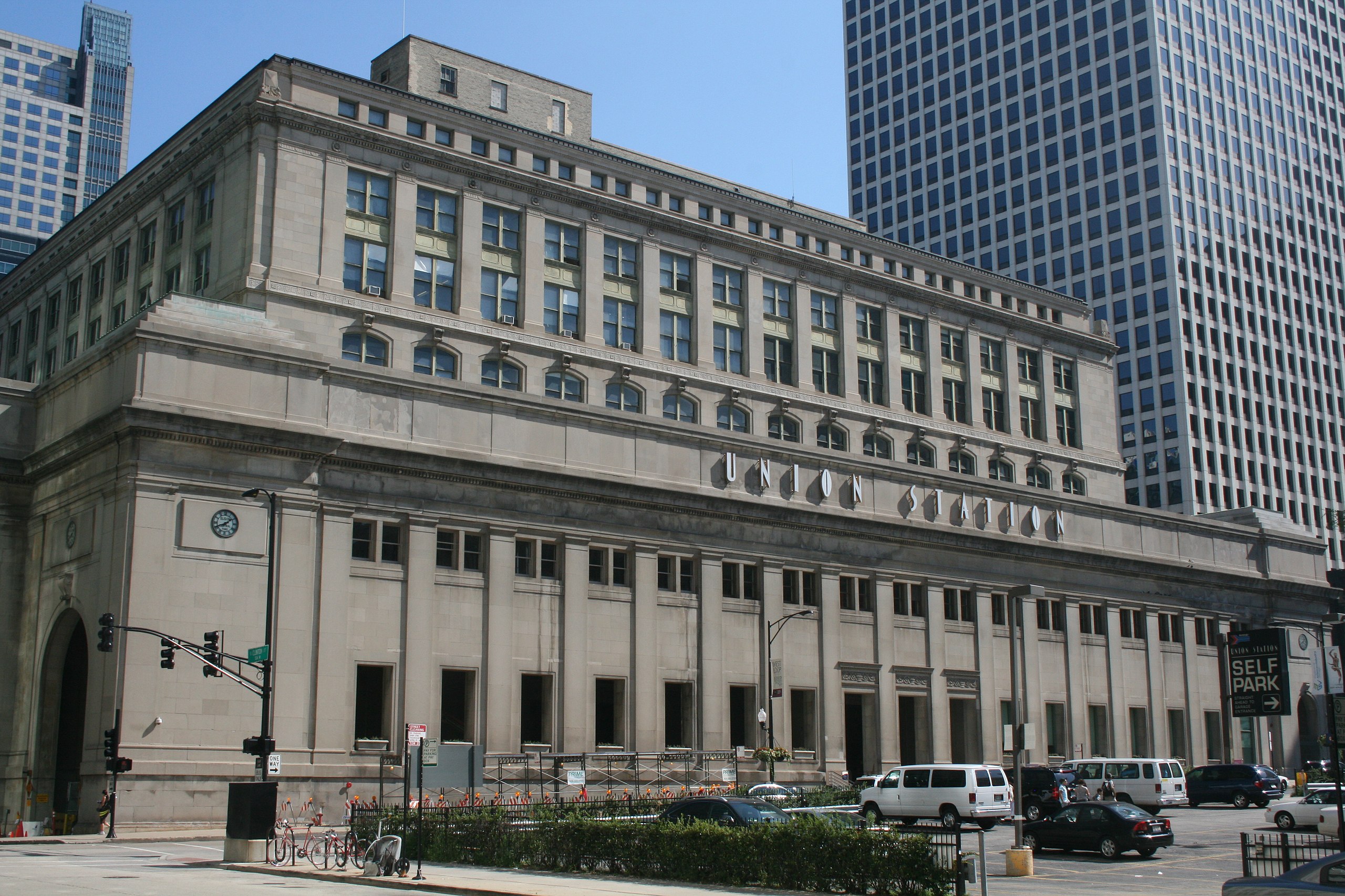
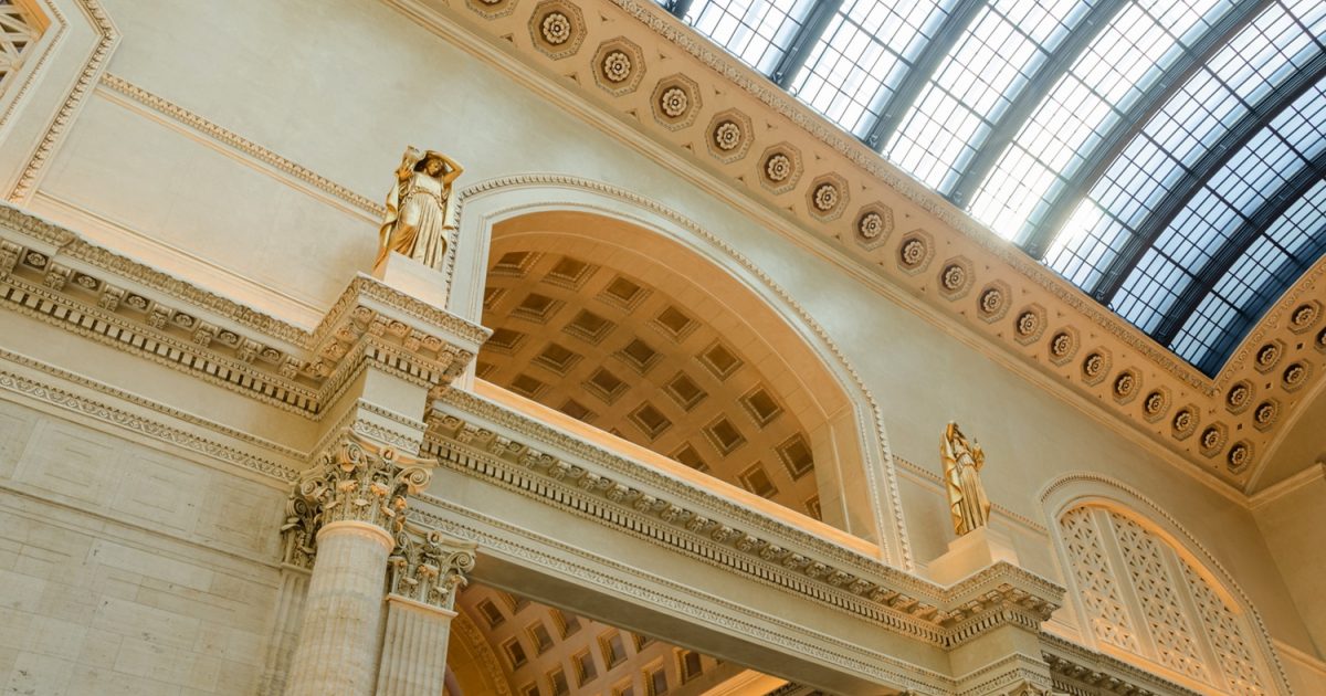
Image retrieved from https://en.wikipedia.org/wiki/Chicago_Union_Station#/media/File:Chicago_Union_Station.jpgimage retrieved from https://chicagounionstation.com/
The Chicago Union Station opened in 1925, and was originally designed by Daniel Burnham, however Burnham passed before the construction began, and the building was completed by Graham, Anderson, Probst, and White. This is the fourth-busiest rail terminal in the U.S., after Pennsylvania Station, Grand Central Terminal, and Jamaica Station in NY. On an average weekday, 140,000 passengers will pass through Chicago Union Station. Construction of the Union Station began in 1913, stalled during WWI, and resumed in 1919. The station finally opened in 1925, and ended up costing $75 million, $10 million over its initial budget. The main building of the Union Station is a square neoclassical structure, that contrasts greatly with the modern glass skyscrapers that surround it. The building also utilized Indiana limestone on the street-level entrances; and marble, glass and iron in the large concourse along the river.
image retrieved from https://www.history.com/topics/landmarks/flatiron-building
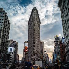
Designed by Daniel Burnham and Frederick Dinkelberg, the Flatiron Building is a triangular 22 story building located on Fifth Avenue in Manhattan, NY. After its completion in 1902, it was one of two “skyscrapers” located north of 14th Street. The Flatiron Building, previously known as the Fuller Building, got its name from its resemblance to cast-iron clothes iron. This building was constructed very quickly, the steel was pre-cut so the frame was able to be assembled at a rate of one floor a week, and total construction time was one year. The Flatiron building is an iconic skyscraper in New York City and was designated as a New York City landmark in 1966, added to the National Register of Historic Places in 1979, and was designated a National Historic Landmark in 1989. However, the building is currently empty, as of November 2020, and the interior is expected to be updated, by adding central heat and air, removing the interior walls on all floors to create open triangular floors, upgrading the elevators and sprinkler system, and add a second staircase. These renovations are expected to finish in 2022, and cost between 60 and 80 million dollars.
Photo taken from: https://www.google.com/imgres?imgurl=https%3A%2F%2Fupload.wikimedia.org%2Fwikipedia%2Fcommons%2F0%2F0b%2FFarnsworth_House_by_Mies_Van_Der_Rohe_-_exterior-8.jpg&imgrefurl=https%3A%2F%2Fen.wikipedia.org%2Fwiki%2FFarnsworth_House&tbnid=e7AlqDUlePcSyM&vet=12ahUKEwjoj6mAkav0AhUUyKwKHU5JA7oQMygAegUIARCnAQ..i&docid=Exf3M6qO5YiqIM&w=5456&h=3638&q=The%20Edith%20Farnsworth%20House&client=firefox-b-1-d&ved=2ahUKEwjoj6mAkav0AhUUyKwKHU5JA7oQMygAegUIARCnAQPhoto taken from: https://www.google.com/imgres?imgurl=https%3A%2F%2Fnthp-savingplaces.s3.amazonaws.com%2F2015%2F11%2F24%2F19%2F09%2F57%2F661%2FFarnsworth-carousel-3.jpg&imgrefurl=https%3A%2F%2Fsavingplaces.org%2Ffarnsworth-house&tbnid=4z11bLN0r02LaM&vet=12ahUKEwjBh8OWkav0AhVD0KwKHfadC-wQMygJegUIARC7AQ..i&docid=xumu12dxEnscNM&w=320&h=180&q=The%20Edith%20Farnsworth%20House%20interior&client=firefox-b-1-d&ved=2ahUKEwjBh8OWkav0AhVD0KwKHfadC-wQMygJegUIARC7AQ
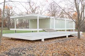
The Edith Farnsworth House is located in Plano, Illinois near Chicago and was built between 1945 and 1951. It was designed as a weekend vacation home for Dr. Edith Farnsworth, a nephrologist, musician, and poet, which is where this architectural structure gets its name. The purpose of the house is to exemplify nature. Personally, I’ve seen this architectural design in many places, I just never knew where it came from. Specifically, I see it a lot in films. It appears to be an architectural design for individuals who are wealthy, and this may be because of who the original client was. Dr. Edith Farnsworth was a very famous and affluent doctor. Although I think that the design is very pretty, the home doesn’t really speak to me. I look at it more as an art piece rather than a home. I do not wish homes to look anything like it, even vacation homes. It appears to serve one purpose and that is to help one connect with nature, but I think it fails at its fundamental purpose which is to be a home. It does not feel homely at all. I do think that there can be a mixture of architecture that helps individuals connect with nature but also provides a nice safe place to call home and this doesn’t really do that. It just feels like it’s a showpiece. Overall though, I think the design is very beautiful. I would absolutely want to vacation in it just for the experience, but I’m not entirely sure if I would enjoy it very much. It does appear to reach its overall goal which is to connect people with nature, and this is done in a very unique and nontraditional way. It emulsifies individuals in the woods and shows the beauty and cruelty of nature (as seen in the floodings). What is ironic, however, is that although the home is meant to allow one to appreciate nature, it ultimately does cause a lot of harm to the planet due to its design (mainly windows) that are not energy efficient.
Photo taken from: https://www.google.com/imgres?imgurl=https%3A%2F%2Fychef.files.bbci.co.uk%2F976x549%2Fp01hcfhx.jpg&imgrefurl=https%3A%2F%2Fwww.bbc.com%2Fculture%2Farticle%2F20130924-less-is-more-a-design-classic&tbnid=t472sDIQ9o-EoM&vet=12ahUKEwjdn8rLj6v0AhXJfqwKHXKaBt0QMygBegUIARDVAQ..i&docid=nS1ufKZWbCE4JM&w=976&h=549&q=The%20Barcelona%20Pavilion&client=firefox-b-1-d&ved=2ahUKEwjdn8rLj6v0AhXJfqwKHXKaBt0QMygBegUIARDVAQPhoto taken from: https://www.google.com/imgres?imgurl=https%3A%2F%2Fimages.adsttc.com%2Fmedia%2Fimages%2F5e6b%2F912b%2Fb357%2F653d%2Fd300%2F00fd%2Flarge_jpg%2F21_Re-enactment_Foto_Anna_Mas.jpg%3F1584107791&imgrefurl=https%3A%2F%2Fwww.archdaily.com%2F935480%2Fartistic-intervention-re-enactment-highlights-lilly-reichs-works-in-the-barcelona-pavilion&tbnid=NDMBeVAZMSFVcM&vet=12ahUKEwjo_rqIkKv0AhVI2qwKHZQtA2MQMygCegUIARCzAQ..i&docid=fvLU3iO2lbYdLM&w=2000&h=1333&q=The%20Barcelona%20Pavilion%20interior&client=firefox-b-1-d&ved=2ahUKEwjo_rqIkKv0AhVI2qwKHZQtA2MQMygCegUIARCzAQ
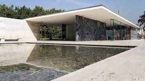
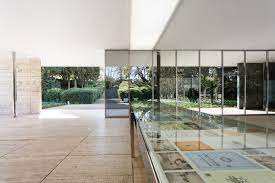
Personally, I’m not much of a fan of Mies van der Rohe’s work. A lot of it looks too plain and cold for my liking. The Barcelona Pavilion has a lot of cool elements, but overall, I’m not much of a fan. The house is definitely a masterpiece, but it just doesn’t appeal to me. The outside of the house looks really cool. It has a lot of marble walls, similar to the Villa Tugendhat, that contrast really works well with the white ceilings. Furthermore, there is a lot of window space, which I like. Finally, I like the pool of water outside of the house. It adds a nice, sophisticated touch to the home. Besides that, I don’t really care for the house. It looks too plain and boring and not like a home. It feels like a place where a bunch of rich people have mid-life crises, instead of a place to relax at the end of a day. The home just feels so empty and lonely. It feels depressing. Yea, it’d be cool to stay in it for a couple of days because it’s something new, and I like new experiences, but I wouldn’t buy it or design anything like it. There are many ways to make a home look inviting and friendly without keeping to traditional styles, but I don’t like this. I also feel like this home doesn’t really fit into Mies van der Rohe’s theme of connecting individuals with nature very well. The tall walls make the place feel cut off and isolated, kind of like a very fancy prison. I will say though that I do also like how the house is a light color. I think I would dislike the home even more if the walls and ceilings were dark. Overall though, the home is really not my cup of tea. I wouldn’t want to live there because it looks like a really uptight office. It doesn’t feel like a home and, therefore, it’s a pass for me.
Photo taken from: https://www.google.com/url?sa=i&url=https%3A%2F%2Fdivisare.com%2Fprojects%2F276366-ludwig-mies-van-der-rohe-libor-teply-villa-tugendhat&psig=AOvVaw3UBHPBBenkuicM-I4A93pz&ust=1637640866751000&source=images&cd=vfe&ved=0CAsQjRxqFwoTCKjFse-Nq_QCFQAAAAAdAAAAABADPhoto taken from: https://www.google.com/imgres?imgurl=https%3A%2F%2Fimg.archilovers.com%2Fstory%2F9052c76c-3ddb-4d02-8f57-5cd352b030eb.png&imgrefurl=https%3A%2F%2Fwww.archilovers.com%2Fstories%2F27352%2Ficonic-houses-villa-tugendhat.html&tbnid=Q_1WpvVZ7HINcM&vet=12ahUKEwiWzYCTjqv0AhUNLq0KHb_yAs0QMygBegUIARCyAQ..i&docid=Li-keZxWtAqjCM&w=766&h=508&q=Villa%20Tugendhat&hl=en&client=firefox-b-1-d&ved=2ahUKEwiWzYCTjqv0AhUNLq0KHb_yAs0QMygBegUIARCyAQ
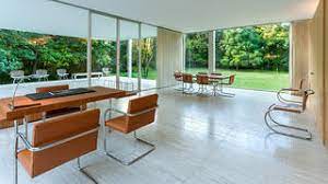
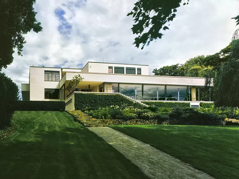
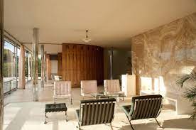
Mies van der Rohe was an architect who very much liked simple designs and that is seen in this house. The Villa Tugendhat looks absolutely beautiful on the outside. It’s simple and yet sophisticated at the same time. It’s elegant and yet humble. I personally love window space and this home has plenty of it. Furthermore, the white exterior adds a nice calming touch to the overall house. The garden also exemplifies the beauty of nature. It’s positioned in a way that doesn’t diminish the beauty of the home, but it also doesn’t look tacky like traditional gardens in some homes. It adds an important element to it. The interior of the house is where things take a turn. It is very nice, don’t get me wrong, but I think it looks ugly compared to the outside. It is very simple and predominately white with a splash here and there of color. It looks bare, empty, cold, and uninviting. The two things that I do like are the natural lighting and the amazing views of nature. However, the inside of the house looks like an art museum rather than a home. It needs more life and less white. Similar to the Edith Farnsworth house, it feels like an art piece rather than a home. I do think that Mies van der Rohe did a good job of connecting individuals to the nature around the house, but I don’t feel like that objective should surpass the objective of making a home feel like a home. The only thing that makes this house feel like a home is the exterior, and even that isn’t really done well. Ultimately, it is very nice though. It looks pretty on the outside, but the inside is just too bland for me. I wish it had more life.
Photo taken from: https://www.google.com/imgres?imgurl=https%3A%2F%2Fcdn.britannica.com%2F77%2F42277-050-98669F2B%2FSeagram-Building-Ludwig-Mies-van-der-Rohe.jpg&imgrefurl=https%3A%2F%2Fwww.britannica.com%2Ftopic%2FSeagram-Building&tbnid=b4YBIrDPM__slM&vet=12ahUKEwjX4aqtjKv0AhVN_qwKHa0AAlUQMygpegUIARChAg..i&docid=FmwAD7BXD62omM&w=852&h=1572&q=the%20seagram%20building&client=firefox-b-1-d&ved=2ahUKEwjX4aqtjKv0AhVN_qwKHa0AAlUQMygpegUIARChAgPhoto taken from: https://www.google.com/url?sa=i&url=https%3A%2F%2Fca.phaidon.com%2Fagenda%2Farchitecture%2Farticles%2F2020%2Fmarch%2F11%2Fphilip-johnson-and-the-making-of-the-seagram-building%2F&psig=AOvVaw1BkoG0t4axXrH0xi4ZIafB&ust=1637640545622000&source=images&cd=vfe&ved=0CAsQjRxqFwoTCJjM3cyMq_QCFQAAAAAdAAAAABAD
The Seagram Building is another one of Mies van der Rohe’s architecture. It was built in 1957 and is located in New York City. The building is bronze and has dark glass, which I’m not really a fan of. It reaches the sky at 38 stories high and has a granite plaza at the ground that looks very beautiful. Furthermore, it capitalizes on having very geometric shapes. This is in contrast to older skyscrapers that usually had a lot of detail and artwork, were not necessarily geometric, and were vibrant in color. I think what is ironic is that although Mies really attempted to make his architecture as simple as possible, there are clearly elements that are used to enhance its beauty. For example, the fake structural frames that are seen within the skyscraper serve little purpose, and yet they are there to “reveal” the frame of the building. This is contradictory to his style because they are unnecessary, and yet all the necessary to depict a minimalist building. Overall, I think this building is a little bland. I do appreciate the simplest style, but I also believe that it really fails to capture the beauty that skyscrapers have. Yes, the Seagram plaza does a good job of highlighting the pure magnificence of a building just being a skyscraper, but I think it fails to add other elements that make a skyscraper art rather than a box of metal. I do, however, think that the plaza is a really nice element. Cities oftentimes can feel really cramped and having the plaza is a way for people to not feel as compact.
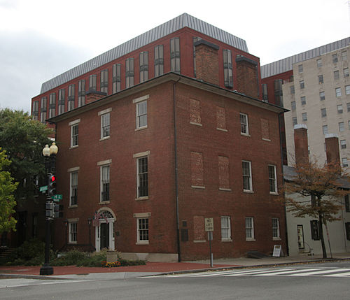
The Decatur House is a historic house and museum in Washington D.C. It was built in 1818 and was designed by Benjamin Henry Latrobe. It is one of the oldest homes in Washington D.C. This along with the Pope Villa is one of the few remaining homes that is designed by Benjamin Henry Latrobe. The building is now a Nation Center for White House History and is managed by the White House Historical Association.
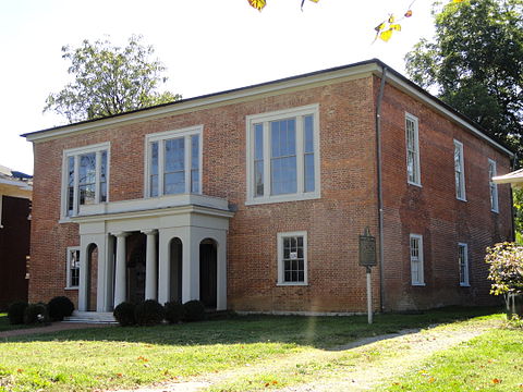
The Pope Villa is located in Lexington, Kentucky, and was designed by Benjamin Henry Latrobe in 1811. The building was designed for Senator John Pope. This building is one of only three Latrobe residences in the United States. This building was bought in 1987 by the Blue Grass Trust for Historic Preservation. It has recently gone through some restoration to give it the look that it had in 1811 and it is now on the National Register of Historic Places.
The United States capital is one of the most recognized buildings in the world. Benjamin Henry Latrobe didn’t come up with the original design, but he later improved the design that was originally submitted by William Thornton. William Thornton got the initial bid for the building when he won the design competition for the building that was put out by Thomas Jefferson. The building is a very classic and beautiful building that has been through some crazy times in US history.
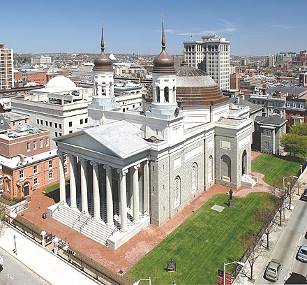
The Baltimore Basilica was the first roman catholic cathedral built in the United States. It was built by Benjamin Henry Latrobe and was built between 1806 and 1863 in Baltimore, Maryland. It held tons of events throughout the 19th century, many of these meetings helped shape the Catholic Church in the United States. In 1969 the building was declared a National Historic Landmark. I think that this building is incredibly beautiful, especially the dome. In 2006 there was a 3 year $34 Million restoration project that brought some of the technology up to date.
Warning: Attempt to read property "comment_ID" on null in /home/thedudeo/fall2021.thedude.oucreate.com/wp-content/plugins/subscribe-to-comments/subscribe-to-comments.php on line 71
Warning: Attempt to read property "comment_author_email" on null in /home/thedudeo/fall2021.thedude.oucreate.com/wp-content/plugins/subscribe-to-comments/subscribe-to-comments.php on line 591
Warning: Attempt to read property "comment_post_ID" on null in /home/thedudeo/fall2021.thedude.oucreate.com/wp-content/plugins/subscribe-to-comments/subscribe-to-comments.php on line 592