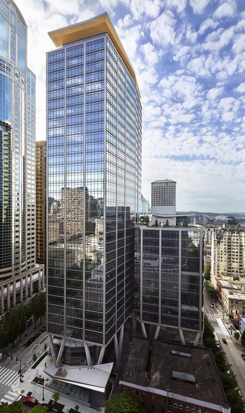
Photo of 2 + U in Seattle, Washington Provided by Pickard Chilton @https://www.pickardchilton.com/work/2u
2+U is another Pickard Chilton project that was designed and built in Seattle, Washington. The idea that Pickard Chilton had, while designing this Class-A Office Tower, was that the building should have a sense of biomimicry and be able to infuse itself into the surroundings. Pickard Chilton claims 2+U was “envisioned as a first-of-its-kind Urban Village” designed to allow for pedestrian traffic to move freely underneath the canopy-like presence of the towers. Within this canopy, a wide array of restaurants, local shops, and outlet spaces are provided to mimic the Pike Place Market nearby. I believe this to be a really fun way to incorporate the office space with the local populace. To many in Washington, the public space is a sacred area meant for congregation and comradery. Pickard Chilton emphasized these values by emulating an open-air tree system which allowed 2+U to maximize the pedestrian walkways, provide weather protection year-round, and profit local businesses along with increasing morale amongst the workforce. Sarah Lloyd from the Curbed Seattle News Group reported on the new towers from the local perspective and provides these words: “Apart from the dedicated creative space, Skanska is currently working with local arts boosters 4Culture on putting together programming to activate the outdoor space.” It seems that Skanska had walkability and the neighborhood experience at the forefront of the corporate brain trust. This is an inspiring principle within the corporate world to begin listening to the community members that will be affected most by their development projects. Instead of placing an eye sore of a building that would take away from Seattle’s city plan, 2+U has found a way to improve the quality of life for Seattle residents while still getting the 2-tower system they wanted.
Information from:
2+U. (2021). Retrieved 12 November 2021. https://www.pickardchilton.com/work/2u
Llyod, S. (2021). Skanska’s 2+U towers carve out pedestrian and creative space. Retrieved 12 November 2021. https://seattle.curbed.com/2018/3/15/17117214/second-university-towers-construction-photos
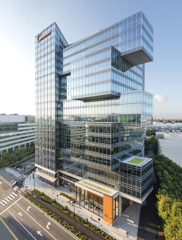
Photo of Akamai Headquarters in Cambridge, Massachusetts Provided by Pickard Chilton @ https://www.pickardchilton.com/work/akamai-headquarters
Akamai Headquarters is a 19-story mixed used building designed by team members at Pickard Chilton. It is located on 145 Broadway in Cambridge, Massachusetts and is designated as the Phase 1 of 3 Phases for the Cambridge Area. This 480,000 gross square foot structure attempts to bridge all of the offices and collaborative areas together via what Sasaki, the interior designers on project, call “The Aka-Mile”. The building was constructed to facilitate a collaborative air. This concept acts as a thread that travels throughout the entire corporate building transfixing one spatial idea to the next . From the lobby entrance to library spaces, cafes, and work areas, “The Aka-Mile” is connected using pathways and interconnecting stairwells that allow the individual to travel freely through the environment without a feeling of displacement or alienation of corporates members. In addition, Pickard Chilton focused on a flexible floor plan and high ceilings to provide plenty of natural lighting and aesthetic character to each and every space. All-in-all, I consider this building to be an interesting take on the collaborative environment. The aesthetics are gorgeous, and the strip lighting used inside this glass and steel beast is truly inspiring. Each strip line of lighting coordinates with lines and directions on a global map. This allows the company offices to be approximately aligned with the world thus imprinting the global scale of their business to the satellite offices in place.
Information acquired from:
Akamai Headquarters. (2021). Retrieved 11 November 2021. https://www.pickardchilton.com/work/akamai-headquarters
Akamai Technologies Global Headquarters. (2021). Retrieved 11 November 2021. https://www.sasaki.com/projects/akamai-technologies-global-headquarters/
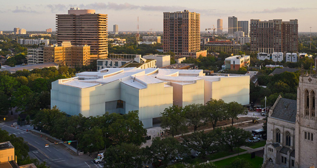
This was a museum space in Houston, Texas was designed by Steven Hoff with exhibition space, galleries, seven garden courtyards, a 215-seat theatre, pedestrian tunnels, parking hall, conference rooms, a restaurant overlooking a sculpture garden, a café, and a triple-story forum. The building has the unique aspect of porosity also present in the Cofco Cultural & Health Center despite being two completely different projects with different purposes. The large gardens and grand entrances help convey a sense of welcoming and openness.
The curved roof, designed to look like cloud circles, cover the roof and allow natural light to come into the building in precise amounts and areas providing the perfect lighting for the galleries. The building is organized into two floors horizontally and all the galleries have natural light and connect in with an open flow. All the galleries surround a central gallery forum with generous space for the exhibition of art and vertical access to the upper floors.
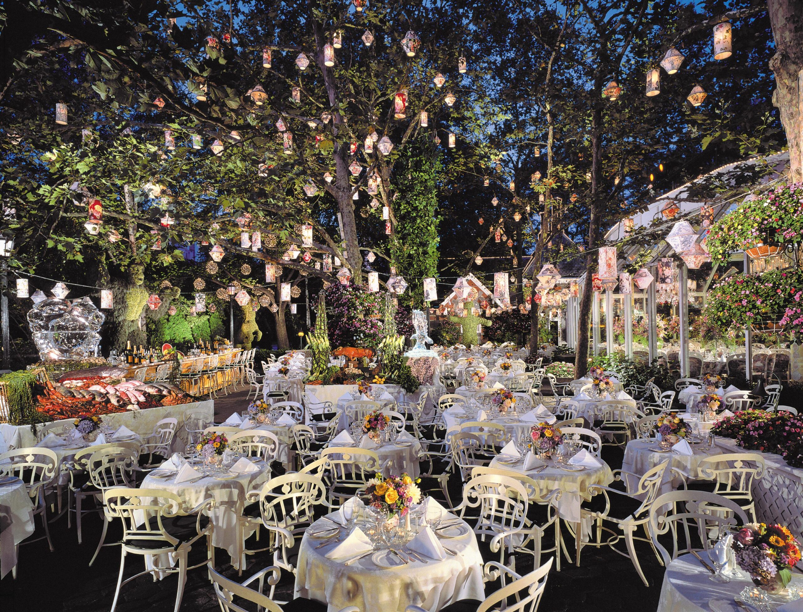
Tavern On The Green. Looks like a pretty nice wedding is going on.
For this blog post, we’re not going to talk about castles or cathedrals or anything even remotely groundbreaking in the world of architecture, instead, I am going to talk about my favorite restaurant in all of New York City. It’s called the Tavern On The Green and as its name suggests it’s a restored tavern on the western edge of Central Park. I love this place and for good reason. I first visited New York City while I was in high school. It was the summer of my junior year and my mother, with New York being her favorite city, wanted to take me before school started up again. So away we went and after getting settled in our hotel in lower manhattan we decided to take a walk to central park because who wouldn’t?
Whether we had planned to go to the tavern or if it was out of pure convenience I can’t remember but eventually, we decided to get lunch there before continuing on. The tavern was originally designed by Calvert Vaux and was originally built as a sheepfold in the 1880s to house the 700 Southdown sheep that grazed in Central Park’s Sheep Meadow. In 1934 Robert Moss turned the building into a restaurant as a part of the park renovations going on at the time. The tavern to this day maintains its original charms. It is styled as a lavish red brick tavern with a few modern renovations to keep it with the times. One of those renovations can be found in the dining area where a large window opens up the entire side of the building and looks out into an open courtyard where guests are also able to dine. I love this dining area, it’s open and bright and allows you to look out into the heart of the park and see all the people going about their lives. Yet even with these modern renovations, the building has this comfy cottage feel about it which can be credited to the ancient-looking rafters that build the ceiling and to the vintage wallpaper that decorates the walls.
But above all the tavern is my favorite place because of its sentimental value to me. It was the first place we went to in New York and it really was just a great first stop on a great trip I went on with my mom, plus the food was not half bad (it’s great). I have been back to New York City several times since that summer and each time I am there I always make sure to have lunch at the tavern. If you ever find yourself in NYC I strongly suggest you give it a try and experience its charms.
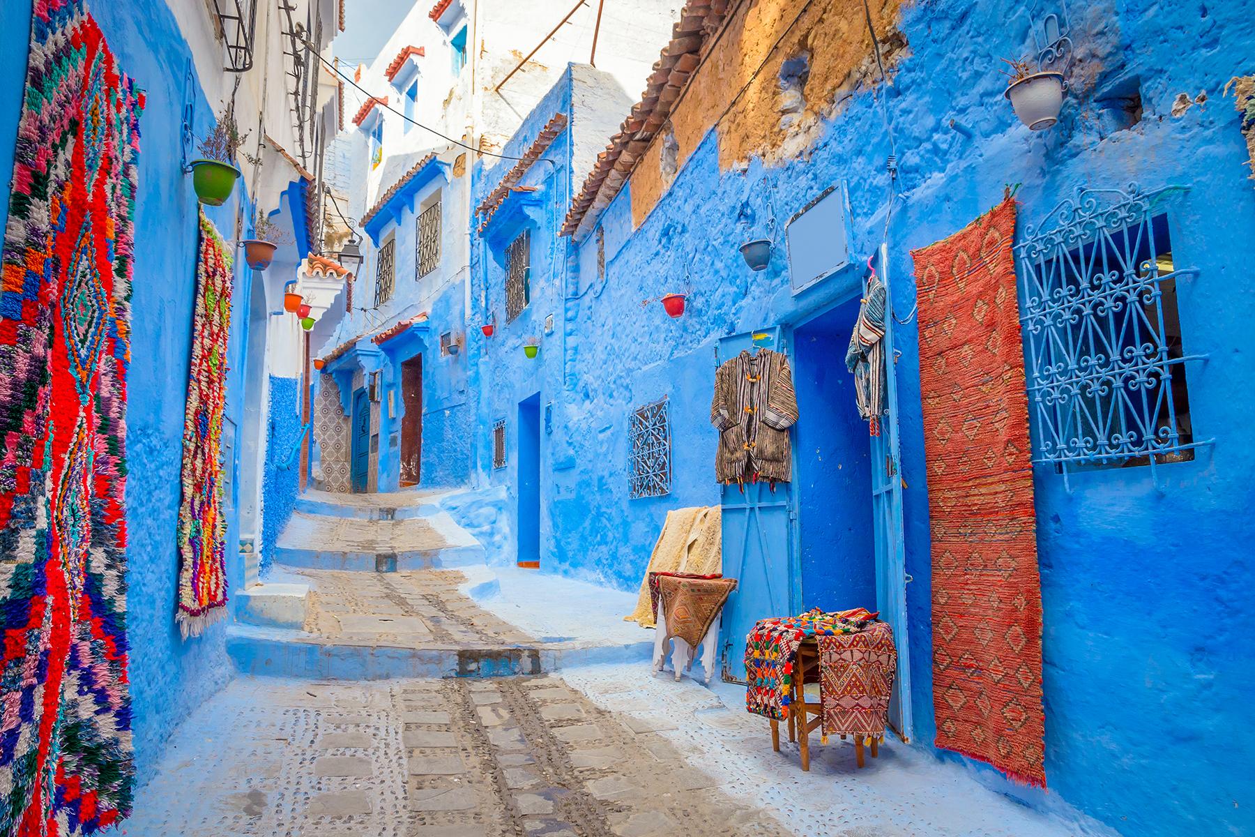
One of the many, many blue alleys that connect the city.
A city! How can you write about an entire city for a blog about the architecture of individual buildings?! Well, dear reader, give me a chance to explain myself. The Blue City of Morocco, also known as the Blue Pearl (and Chefchaouen to the locals), is one of the most unique places in all of Morocco and indeed one of its prettiest. Built out of the golden dunes into the cliff sides of the Rif Mountains, the Blue City is a small blue dot in a country of tan and green. Founded in 1471, the Blue City was built to defend against the invading Portuguese. Two decades later and the city would expand with the arrival of Muslim and Jewish refugees fleeing forced conversion to Christianity in Granada, Spain. These newcomers are credited with the construction of the signature whitewashed houses and courtyards filled with citrus trees while also being influenced by Arabic styles of architecture. This in its own right makes the Blue City worthy of a blog about its unique architectural style, yet its true selling point is the dazzling blue that every house is painted with. Now, there are plenty of theories as to why this is the case, many believing it was motivated by the theological beliefs of the Jewish people who had migrated to the city, who, as legend has it, wanted to paint the houses blue to represent the sky which helped remind them about the presence of God. But, I have reason to believe that this is not the true reason. As a local would tell it the reason the houses are painted blue is for a practical reason rather than a theological one. Simply put the buildings are painted blue in an effort to drive away mosquitos and prevent malaria. This all being said of course as a mosquito casually sucked away at my arm, so actually maybe take this theory with a grain of salt. With all these fascinating details in mind, I think it’s perfectly reasonable to classify the entire city as one architectural marvel, and if you disagree with me then too bad I’m still going to talk about it.
I visited the city in the summer of 2019, and if you have read any of my other blogs before now then I am sure you have gathered by now that the summer of 2019 was a pretty busy time for me. Anyways, I had found myself in Morocco towards the end of July with a few other friends and had taken a bus tour to the city on one of our final days in the country. Just two hours outside of Tangier, the city is one of the biggest tourist destinations in all of the country. We arrived at the base of the city and were immediately welcomed by locals hoping to take us into their shops. After a bit of shopping, we decided to explore deeper into the maze-like alleys of the city. Eventually, I stumbled upon a river that cuts through the center of the town. Following it downstream I came across an informal bar setup in the riverbed. People took off their shoes here and sat in plastic chairs on top of the slick rocks. The bar, which was truly nothing more than just a tent and a table, was set against a nearby waterfall. Behind the table, the bartender let buckets of fresh fruit wash in the falling water. He then would slice the fruit and serve them on a paper plate for 4 dirhams (roughly 1 USD). After getting a beer and a plate of fruit I came across some ruins on the outskirts of the city. I was very fascinated by the ruins, knowing they must be hundreds of years old but also fascinated by how they were designed. They were made out of this very old stone and formed in a series of arches that built down into the river. I was very curious about what purpose they had served in the past, an old house, a church? Who could say, but regardless they stayed with me for some reason as I continued to think about their original purpose.
Before long it was time to leave, and after getting lost a couple of times, we made our way back to the bus. The Blue City was a marvelous adventure during my time in Morocco. Many of the cities in Morocco are beautiful and are all great examples of the wondrous world of Arabic architecture. But the Blue City stood out in such a different way. I think what stuck with me about its architecture is how it was its own thing, a homogenous whole really. None of its buildings look like the other buildings you’d come to expect in the cities of Morocco. Instead, they are made in a whitewashed style that you would be likely to see on the bountiful shores of Greece than in the arid dunes of the Sahara, and I think that’s something really amazing.
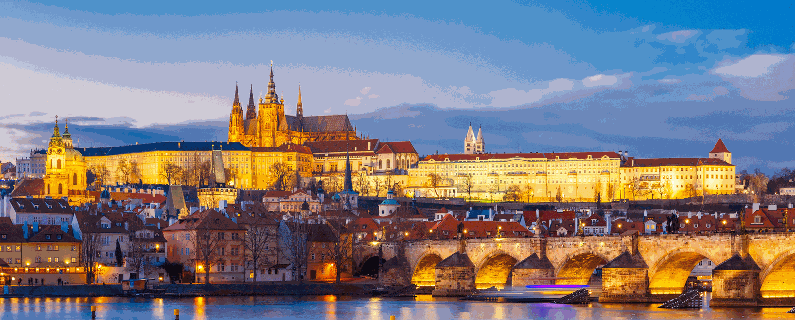
In the summer of 2019, I had the pleasure of visiting the city of Prague in the Czech Republic. Prague, in all of its glory, is one of the most beautiful cities in the world. Every building is an architectural treasure, making full use of the gothic style with arched peaks and flying buttresses. However, the real crowning jewel of the city in my opinion is the Czech Pražský hrad, or simply the Prague Castle. The castle lies in the historic center of Prague, sitting just west of the Vltava river. The castle has its origins during the 9th century under the reign of Bořivoj, the first Christian prince of Bohemia. The castle would also later feature a beautiful cathedral on Hradčany Hill. The construction of the cathedral started in the 14th century and was designed in the late gothic style by architect Petr Parléř, yet construction on the cathedral would not be completed until 1929.
Czech Pražský hrad was the first castle I had ever visited. My mother and I had decided to spend the day exploring the entirety of the castle. After a long, long, journey up the stone stairs leading to the castle gates, we took our time to explore the grounds. There were many gardens and crypts to look through. Maybe unsurprisingly the cathedral was the best part of the experience. It was enormous and made entirely of dark stone and clay. The ceilings, in typical gothic style, were high and vaulted. What I found most amazing was the painted glass. Never in my life have I seen such tall windows, they reached upwards to well over 20 meters. Further, every part of the windows displayed an imaginative portrait of an Abrahamic figure in a glorious array of colors. Another area of the castle that we had a chance to explore was the Golden Lane, a small neighborhood outside the main grounds of the castle, where Franz Kafka briefly lived with his sister from 1916 to 1917. My time at Czech Pražský hrad was indeed one of my favorite moments of my entire trip. The scale of the castle was awe-inspiring and as a fan of the fantasy genre, it really captivated me to explore its hallowed halls. I would strongly recommend it to anyone visiting Prague.
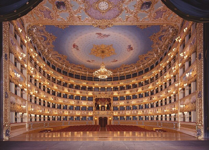
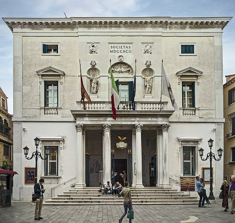
La Fenice is an opera house in Venice, Italy. It is a very famous and popular opera house that has been around since 1792. Unfortunately, a fire burned the opera house in 1996, it therefore had to be reconstructed and restored. Aldo Rossi was initially hesitant to participate in the restoration of La Fenice even though many people involved were hoping he would take the project on. However, Rossi agreed to designed and restored the current La Fenice. Rossi had the daunting task of restoring and recreating what he could but also reinventing what was no longer present or functional. To aid him in his endeavor Rossi captured images of the theatre from the Senso film and used those as inspiration for the reconstruction. Rossi did extend the seating of the building from 860 to 1,000 seats. Rossi’s plans helped revive La Fenice and bring it to it’s former glory. The outside of the building is more subdued and plain while the inside is anything but. The gold accents and painted ceiling bring you back to when La Fenice was originally built. The atmosphere inside transports to you to past while you enjoy the opera on stage. Rossi succeed in restoring the Grand Opera house if Venice, Italy.
Teatro La Fenice (Venice) – Facade
image taken by Didier Descouens and retrived from: https://en.wikipedia.org/wiki/La_Fenice#/media/File:Teatro_La_Fenice_(Venice)_-_Facade.jpg
featured image taken by Pietro Tessarin and retrived from: https://en.wikipedia.org/wiki/La_Fenice#/media/File:La_Fenice_Opera_House_from_the_stage.jpg
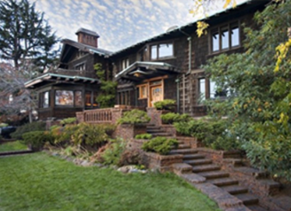
The Thorsen House was built by the Greene brothers in 1909 for the Sigma Phi Society. This is regarded as one of their greatest works because of the extreme attention to detail in every aspect of the house and the surrounding landscape. The house contains intricate wooden stairways and walls. It is combined with some astonishing ironwork of light fixtures and as well as stained glass to bring the whole house together.
This house stands head and shoulders above the surrounding neighborhood. Their surrounding neighborhood consists of traditional brick buildings, but this wooden structure truly stands out. The building incorporates so much design and detail that it boarders the line of becoming more art than house. This is one of my favorite buildings he has ever made because he took the time to change the landscape to complement the house. In their other works their buildings felt a little out of place, but this building works with the environment making me love it the most out of all of his works.
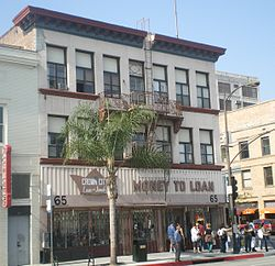
The Greene brothers were known to turn down the majority of commercial buildings because they were not able to put in the same amount of detail as they would be able to for residential properties. This old shop in Pasadena California is the only surviving commercial building they designed that is still standing today. It was made with made by conventional methods and does not embody their traditional attention to detail.
This building is really nothing to note in my eyes as there is nothing unique or special about this building. It appears to look almost exactly to the buildings that are beside it. The Greene and Greene trademark and the reason they were admired by me and others was because of their craftsmanship and attention to detail. In this design, they did not put the effort and soul into this project like they did for their residential.
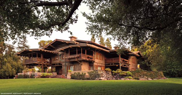
Charles and Henry Greene constructed the Gamble House for the Procter and Gamble family in 1908. The Greene brothers spared no expense in the construction and design of this house. They designed everything from textiles to furnishings with inspirations from Japanese architecture. They also, hired 10 local craftsmen to help hand craft every single inch of the building.
I personally love the design of the house as it looks nothing like many of the cookie cutter houses of todays day and age. The woodworking on the interior is absolutely amazing because everything inside the house was made to go together. Each piece of furniture looks like it was meant to be there rather than the next best option. Overall, the craftmanship on this house is amazing and is probably why it became a national landmark with dozens of tours a day still occurring at this house.
Warning: Attempt to read property "comment_ID" on null in /home/thedudeo/fall2021.thedude.oucreate.com/wp-content/plugins/subscribe-to-comments/subscribe-to-comments.php on line 71
Warning: Attempt to read property "comment_author_email" on null in /home/thedudeo/fall2021.thedude.oucreate.com/wp-content/plugins/subscribe-to-comments/subscribe-to-comments.php on line 591
Warning: Attempt to read property "comment_post_ID" on null in /home/thedudeo/fall2021.thedude.oucreate.com/wp-content/plugins/subscribe-to-comments/subscribe-to-comments.php on line 592