Lake|flato: Courtyard house

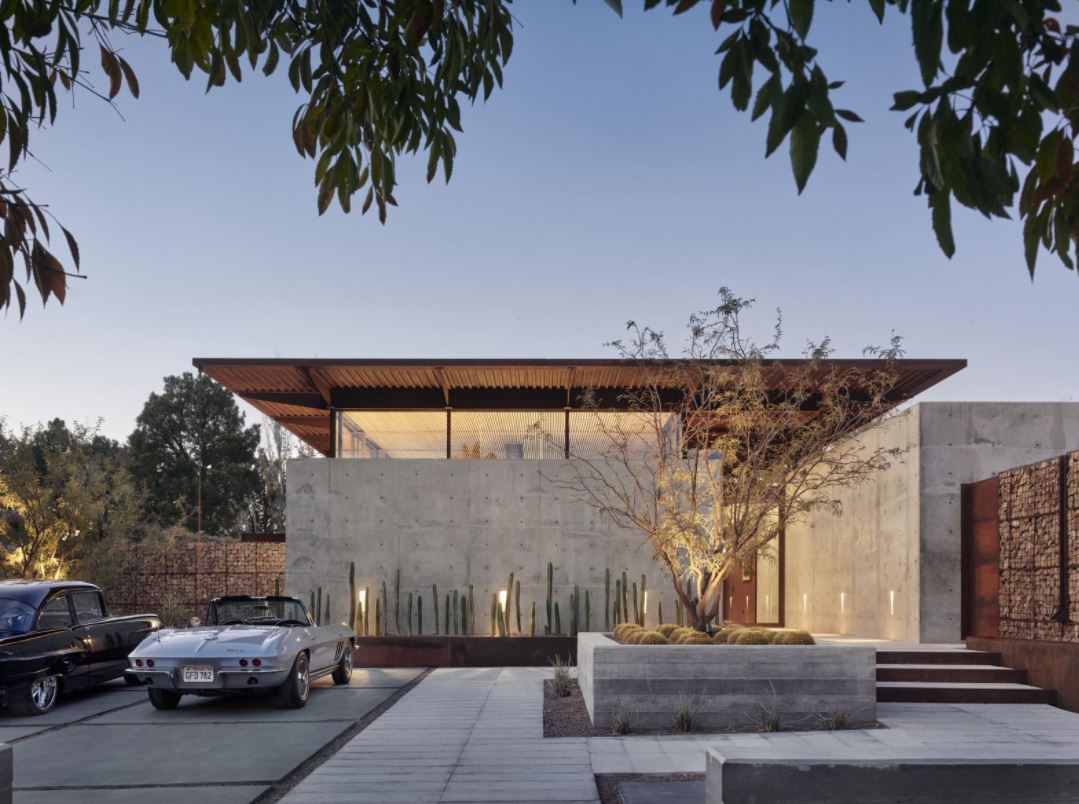
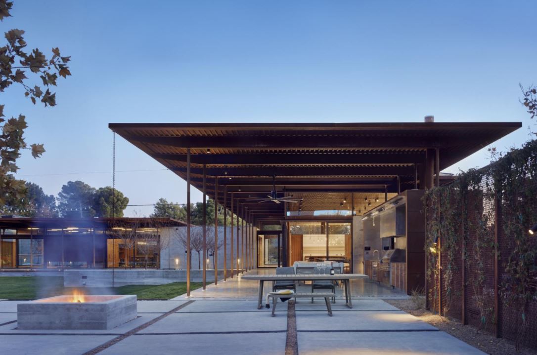
This is another residential build by Lake|Flato Architects. The Courtyard House in El Paso, Texas stood out to me because of the large use of exposed concrete. The concrete walls give the home an extremely modern look. From the front exterior, the house seems rather closed off and private with its towering concrete walls. However, around the back side of the house, it is a completely different atmosphere. The back yard has a much more open concept with large windows seeing into the interior of the house and large courtyard. This is where you can clearly see how the home got its name. The courtyard is very inviting and yet it has a calm feeling to it. I think this is because the large use of concrete still, however, there is also the use of other materials and also a grass area which is what I think gives it that “homey” feel.

Circular Sun House-Frank Lloyd Wright

My next favorite work of Frank Lloyd Wright is the Circular Sun house located in Phoenix, Arizona. This home was built in 1967, and only one of the fourteen circular homes built by Wright.  The home is 3,095 square feet, with three bedrooms and three bathrooms. Wright believed that garages would “attract clutter,” so this house lacks one. The home sits nested into the hill side of rock and cacti and follows the same neutral color palette as most of his work. His “organic” style is conveyed here by the way the house weaves into the natural landscape and over looks the Palm Canyon across the valley. My ultimate favorite aspect: the swimming pool. The house has been used as an Airbnb and recently put on the market.

DCIM\100MEDIA\DJI_0551.JPG

Fallingwater-Frank Lloyd Wright

Frank Lloyd Wright is an American architect who designed more than 1,000 structures. His work is known as “organic architecture” because of his skill of combining peaceful harmonic places with humanity. I am going to discuss my top 4 favorite works in these blogs, starting with Fallingwater.

Fallingwater is a house designed by wright in 1939 located in Mill Run, Pennsylvania. It sits surrounded the Bear Run Nature Reserve and is nested away in the forest and blends in with the trees. Wright’s organic style can be seen through the neutral color palette of browns, tans, and Cherokee red. With the natural stone, stairs leading directly to the riverbed, and a waterfall pouring directly off the house, this home is a statement of Wright’s style, and by far a favorite of mine.

Ogden Centre

https://www.archdaily.com/867192/ogden-centre-studio-libeskind

The Ogden Centre is located at the Durham University as a fundamental physics. It was designed by Daniel Libeskind and completed in 2017. It is designed as continuous, stacked, and interlocking forms. The interiors include a natural color palette of soft grey concrete, warm wood finishes, and frosted glass. The Ogden Centre has views of Durham City and Durham Cathedral.

Daniel Libeskind created a new identity for the Centre in which its a unique individualized workspace that engenders a sense of connection and community.

Daniel Libeskind said, “This project is an example of how to design a highly-sustainable, dynamic building within tight programme requirements. Light and openness is at the core of the design; at every move in the design process we incorporated simple, yet robust materials and considered the users’ experience to create this important building for Durham University.”

Interior view from above

The Ogden Centre peaked by interest due to the vertical timber cladding and amount of windows. It feels like it is well connected to nature. The different angles and bold structure of Daniel Libeskind’s work is my favorite part of his designs. It draws your attention to his buildings and leaves an everlasting impression. I love how the exterior forms translate to the interior elements as well.

lake|flato: marine Education center

This is another heavy timber project by Lake|Flato Architects in Ocean Springs, MS. The Marine Education Center was a new build after the previous center was destroyed by Hurricane Katrina. The owners wanted something that was sustainable and also fit in with the surrounding environment. I think the design shows exactly that. The building has an award for sustainability and with the extensive use of wood and heavy timbers it absolutely fits in with the environment.

lAKE|fLATO: vERDE cREEK RANCH

Lake|Flato Architects have done a lot of really neat projects. But as I was looking through some of their features projects, I noticed they have done quite a bit of ranches. One of the many ranches that stood out to me the most, was the Verde Creek Ranch in Texas. This family style home sits in a secluded wooded area near a pond surrounded by a plethora of Cypress trees. The building itself it majority heavy timber, that is actually Cypress as well, with lots of large glass windows and a little bit of concrete and stone thrown in here and there. Personally I love the look of this home. It has elements of a “log cabin” type home, but with a modern twist. There is a lot of open space in this house with tall vaulted ceilings showing the wood trusses and metal connections. With all the windows in this house there is so much natural lighting, which I feel like makes the space so inviting and probably why I myself was drawn to the images of this home.

Denver Art Museum

https://www.archdaily.com/80309/denver-art-museum-daniel-libeskind

Architect Daniel Libeskind’s extension to the Denver Art Museum, The Frederic C. Hamilton Building, was completed in October 2006. The existing building was designed by the Italian architect, Gio Ponti. The museum was inspired by the vitality and growth of Denver, CO and has become a major cultural landmark for Denver.

“The materials of the building closely relate to the existing context as well as innovative new materials (such as titanium) which together will form spaces that connect local Denver tradition to the 21st Century.” – Daniel Libeskind

Interior Atrium

The building caught my attention due to its interesting shape. Daniel Libeskind uses a deconstructivist style which is characterized by fragmentation and distortion. I have never seen a building that looked so sporadic in construction. I first hated the different directions that the structure goes, but after looking more at it during my research, I found out that I actually love it. The interior is interesting as well as it follows the similar forms as the exterior of the building and some of the art exhibits/displays form to work with the unique shapes.

The Metlife Building – Walter Gropius

The Metlife Building was previously known as the Pan Am building and was built in 1963. It was sold to Metlife in 1981. It is one of the most recognized structures in New York City and actually featured in the Avengers and Catch Me If You Can. The Metlife Building was built for both office and commercial space and it was originally called the Panam Building because Pan Am owned and operated a majority of the floors of the building. I really think that Gropius was an excellent architect who could design almost any type of project. No scope of work was too difficult for him and he was able to execute every project strategically. He constructed a monument, a US embassy, and a commercial building. Now of course two of these projects are commercial use buildings, but they vary in their scope of work. I was extremely impressed by Gropius’ variety in his designs and I was continuously surprised when I was looking through the buildings that he designed throughout his life.

Álvaro Siza – Bonjour Tristesse Apartment

Built in 1987, the Bonjour Tristesse Apartment building was created for the Berlin International Building Exhibition of 1987. Siza, among other progressive architects, were selected to design the buildings for Berlin after the war and help create a new image for the city. While the housing project was intended to modernize the area, it seems to blend into the Soviet style aesthetic. At first glance, this building seems to blend in to the scene. It doesn’t stand out or pop to the eye. Yet, its oddity creates a mesmerizing experience that leads to uncovering more interesting features.

Álvaro Siza – Piscinas de Marés (Pools on the Beach)

These salt-water pools were built in 1966 in Leça da Palmeira, Matosinhos, Portugal. At only 26, this project became Siza’s most recognized piece. The entire project consist of two pools, changing rooms and a restaurant and sits within the natural rocks along the coast, leaving the view of the beach completely uninhibited. What makes this site unique is the use of the natural landscape within the project. While the materials are starkly different, the contrast compliments the aesthetic and atmosphere of this piece of art.

css.php