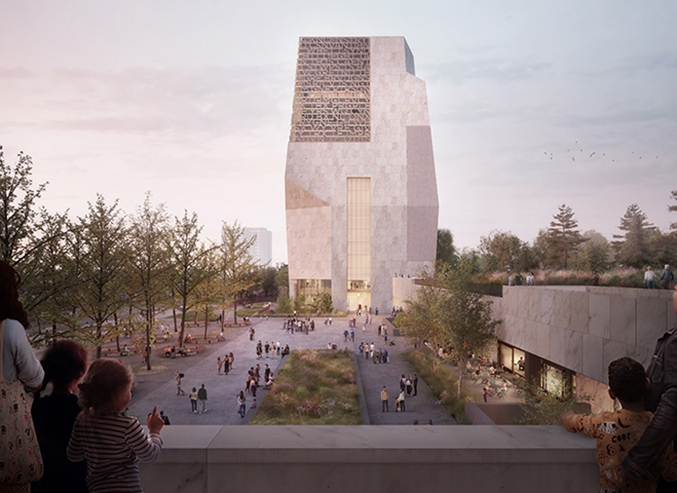
Designed by Tod & Billie Tsein Currently under production, the Presidential Center’s designs are incredible. There is a large museum tower, which is the focal point of the project. There is also a forum and public library. The project is unique in the fact that is centered around a person. The project is meant to be symbolic of the former president’s work and accomplishments. Tod and Billie’s focus on working from inside out directly correlates to the project. This is symbolic of the idea that what truly matters comes from the inside. The other aspect influence of Tod and Billie that relates to the project is the use of the grounds below. Obama wanted to emphasize the impact of Chicago on his life. The project will use the landscape and ground as part of the project to symbolize the importance of Chicago’s on his life.
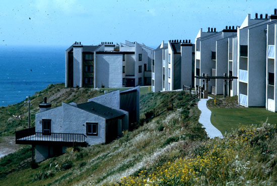
I chose this project of Beverly Willis because I really like the location, and how she utilized the apartments to take in the view that they offered.
As you can see above the location of these apartments is both beautiful and complex. They overlook water on a raised area. This makes the project that much more complicated, due to factors such as the stability of the soil and ground and also possible erosion that will take place during the years that those apartments sit there. The major challenges in this project were keeping the apartments affordable, making sure that they were structurally sound, and that they maximized the views of the ocean. I think this was one of the more logistically difficult projects she was involved with. As just figuring out how to lay these apartments out was a struggle in its self, so much of a struggle that the first owner of this land couldn’t figure it out.
By looking at the apartments you see just how many windows are incorporated. I really like this because she did a great job at accessing the view provided as much as possible, and tried to give each unit a view of it. She also included a tennis court, children’s play area, and other amenities on this property to make it as enjoyable as possible. You can also see that the style of the apartments matches the overall vibe of the area. And also that the style is in touch with the prominent housing style during the ’70s. I like the colors and materials used in the design of the exterior because it makes the age of the apartment better than some of the other materials that were used in the ’70s. All though you can tell when it was built the apartments still look good now almost 50 years later. And given their location and the land, they’re beneath it is pretty impressive they’ve held up so well.
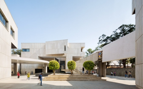
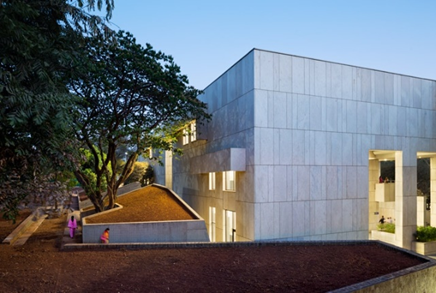
This project was designed for Tata Consultancy Services in Mumbai, India. The campus was designed to be accessed on foot. The buildings were subsequently built low to the ground, to emphasize the importance of the landscape. They wanted to showcase the beauty of the land around the building, so buildings are built at lower levels to experience the landscape. The focal point of the workstations is the lighting. There are many studies done on the importance of lighting and productivity. Especially in India where monsoons ravage the landscape, it is important to have access to quality lighting all the time. Part of the effort to increase this was the sharing of lighting between rooms. Instead of having the rooms walled off, some of the walls are replaced by glass. This allows light to be shared by multiple rooms and increase the amount of lighting in a space. The last part of the project that was considered was the temperature of the campus. Mumbai is hot year-round, so the importance of climate control is important to the design. The goal was to reduce the amount of energy needed, and because there were large amounts of windows, heat could easily enter the buildings. To solve this problem the implementation of fans in the design was important. Convection is the process of heat rising. Tod and Billie used fans to push the heat up and out of the building. Because the building is built into the ground, the floors are cool and can stay cool throughout the warmer days or weeks.
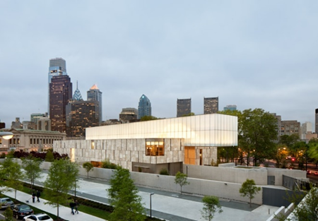
The Barnes foundation building is one of the coolest buildings I have seen. The colors compliment each other very well. This building was built in 2012 in Philadelphia, PA. The Barnes Foundation building is home to an art education facility. The facility houses a collection, art education, and a gallery. The building was built to resemble a light box. The building is deemed to have, “a gallery in a garden and a garden in a gallery.”
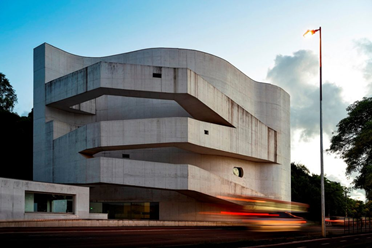
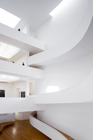
The Iberê Camargo Museum is an art museum dedicated to the late Brazilian painter Iberê Camargo. Built in 2003, the museum sits on Guaiba Lake in Porto Alegre. The building consists of three floors with ramps that line the wall and spiral around the perimeter of the interior. Interestingly, upon entering, visitors take an elevator straight to the top of the building where they then walk the ramps downward with access to the art displays. The blend of curves, sharp angles and unironic monotone color draws intrigue and is reminiscent of a building from Tony Hawk Pro Skater.
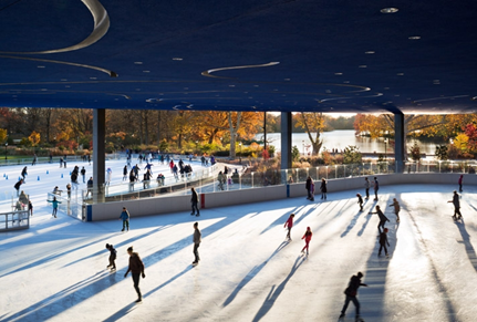
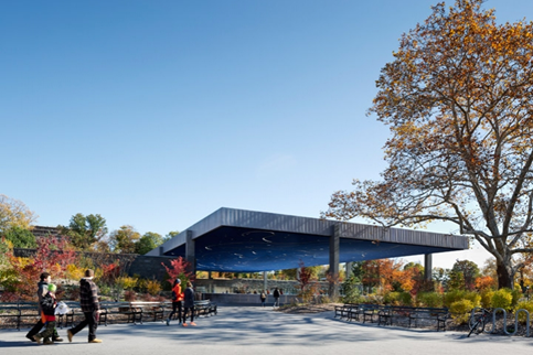
Designed by Tod&Billie Tsein The Lefrak Center is an incredible work by Tod and Billie. The Lefrak center is a pavilion lakeside in Brooklyn’s Prospect Park. The pavilion was design for skating, boating, classes, and other events. The Lefrak Center is an amazing work by Tod and Billie. They wanted to emphasize the importance of the park, so they focused on the continuity of the park with the pavilion. When you approach the center, you can barely see the pavilion over the hill that leads up to it. But when looking at it from the lakeside, the whole building is visible. This shows that the park was the focal point of the pavilion. They used negative space created by mounds of dirt. When walking through the pathways, you think the walls are the building but in reality, the ground is slowly descending deeper. Because the Pavilion is highly used for ice skating in the winter, on the bottom of the roof, there are carvings that mimic the work of a skater. Many ice skaters were judges based off of the designs that were created by the carving of the skates into the ice during their performance. Tod and Billie wanted to mimic this idea, so the bottom side of the roof was painted to mimic this idea. The roof is mirroring the skaters. The idea behind the design is brought to light by the interiority.
The embassy of the United States in Athens, Greece was completed on July 4th, 1961. This project is easily my favorite by Gropius. He implemented the same marble used for the Parthenon as well as multiple other marbles native to Greece. What I love about this building is that it is a US embassy, but it uses the architectural and structural elements of the country it’s in. It may be a building made for the use of another country, but Gropius put his own twist on it and included Greek elements in the construction which I think is very interesting. The renovation and rehabilitation of the original building began in 2018 and is expected to take 5 years.
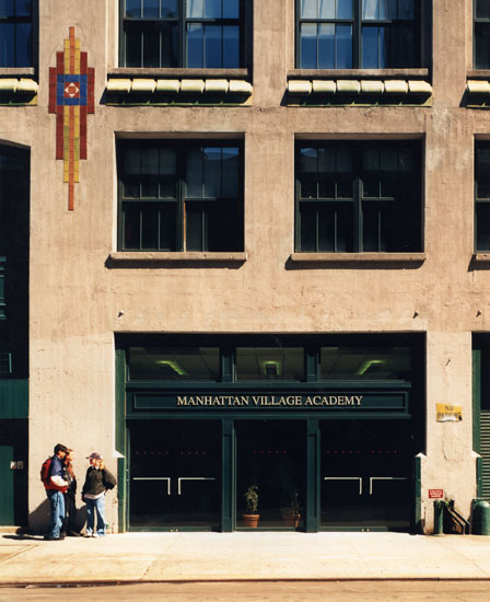
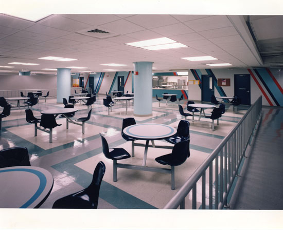
This building was a part of a redesign of an existing office building to create a high school for over 300 students. I think the most interesting part about her work on this building is that it wasn’t a building from scratch, the building was already there and she had to transform it into a school. I think this school really speaks to her talents. It’s hard to take something that was used as an office building and transform it into a building that fosters learning and can also be appropriately used. Especially in New York City where spaces are already small, this is no easy feat. A characteristic that the building was lucky enough to have large windows, this makes it easier to layout classrooms and can also make the classrooms appear bigger than they actually are. I think overall Beverly did a great job at redesigning this building. She was able to create open and unobstructed spaces. She also smartly divided which rooms need windows and which ones can do without. On the interior of the building, you will see that she decided classrooms should have windows and the space in the middle can be devoted to break rooms and a cafeteria. I think this was really smart because you spend 30 minutes in the cafeteria and 7 hours in classrooms.
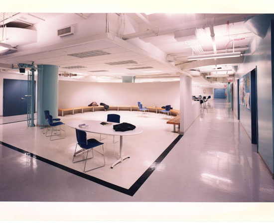
As you can see above she utilized all the space that she was given. Some of the spaces that didn’t have windows could’ve been seen as wasted space. However, Beverly took those spaces and made them useful. Like above she creates space without windows into a study/common area. An area that students can enjoy when they aren’t in classes.
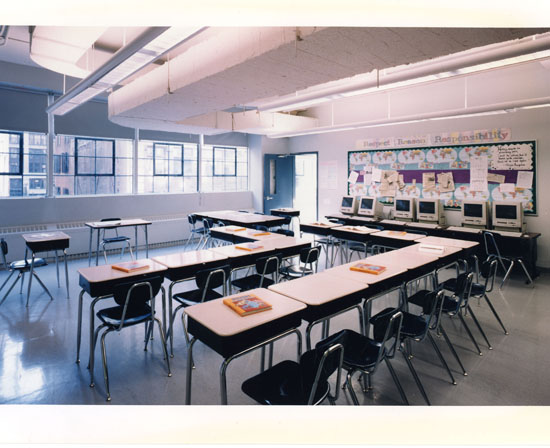
As you can see in the picture above the use of natural light in classrooms was well executed. The classrooms offer a view of the city that sits outside with pretty large windows and decently high ceilings. She also created a well-spaced cafeteria that can hold a large number of students at once.
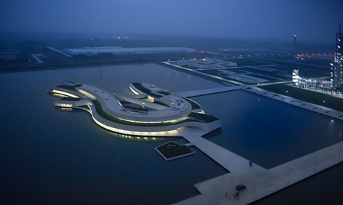
Built as an office building for an industrial factory, the “Building On The Water” is seen floating In the middle of a lake in Jiangsu, China. This visually stunning building was built in 2014 and is just as remarkable on the inside as it is on the outside. Álvaro Siza was chosen specifically to design the office with the idea a floating building as the basis. Siza recruited Architect Carlos Castanheira to aid in its design. The horseshoe shape is particularly unique and the over-saturation of neutral colors and abstract architecture gives this building a timelessly futuristic feel.
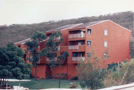
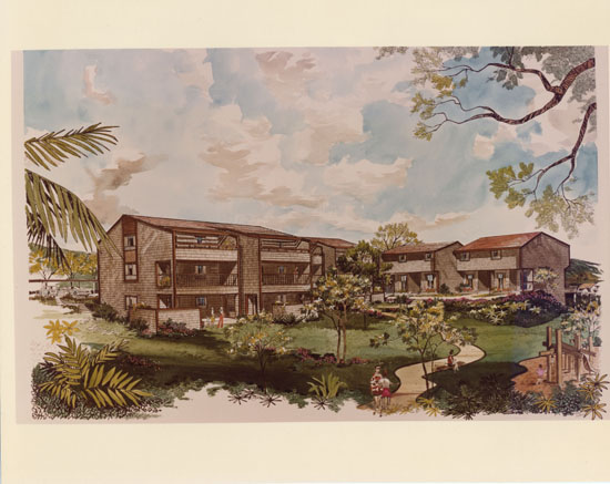
I found this project of Beverly Willis particularly interesting. This project was a huge project as it included housing, schools, parks, etc. This is also a very important project as it was meant to be a complete community for military families stationed in Hawaii. Beverly won the bid for this project for 115 million in 1974. This project was no easy feat as she would have to create a community that encompassed apartments meant for families. The plan for this community was to feature 2600 family-sized apartments. Everything about this project was impressive, especially the budget and timeline. She managed to design over 500 buildings in less than 9 months, and the construction was amazingly fast and efficient.
As you can see in the designs and actual picture of the building that these apartment units encompassed a lot. The architectural style of housing is spot on with the time period these were designed and constructed. As you can see by the shape of the roof, they had just enough slope for rain but not a steep slope as snow isn’t an issue in Hawaii. I think it’s also important to note the number of windows each unit processes. As these are meant for families there are multiple rooms in each unit, and from the looks of it I think Beverly did a pretty good job of trying to incorporate as much light as possible, but during this time natural lighting wasn’t as prized as it is today.
Another thing I really like about these apartments is how much greenery outside of each building they offer. There are large grass/lawn areas outside each building. This community also has lots of playgrounds and vegetation, something that I was excited to see. As they are trying to house as many people as possible I am happy to see that they didn’t sacrifice the importance of the environment they were building on and the need for open space in general.
Warning: Attempt to read property "comment_ID" on null in /home/thedudeo/fall2021.thedude.oucreate.com/wp-content/plugins/subscribe-to-comments/subscribe-to-comments.php on line 71
Warning: Attempt to read property "comment_author_email" on null in /home/thedudeo/fall2021.thedude.oucreate.com/wp-content/plugins/subscribe-to-comments/subscribe-to-comments.php on line 591
Warning: Attempt to read property "comment_post_ID" on null in /home/thedudeo/fall2021.thedude.oucreate.com/wp-content/plugins/subscribe-to-comments/subscribe-to-comments.php on line 592