
The Monument to the March Dead was erected between 1920 and 1922. It was created to honor the workers who died during the Kapp Putsch, which was a coup d’état that attempted to overthrow the Weimar Republic. It was later destroyed in 1936 by the Nazis because they considered it “degenerate art”. I really like this project by Gropius, it shows that he has variety in his architectural skills and is not afraid to offend anyone with his designs. By submitting it into a competition for Weimar artists, he politicized his art and that is the reason why the Nazis destroyed it. It was later reconstructed in 1946.
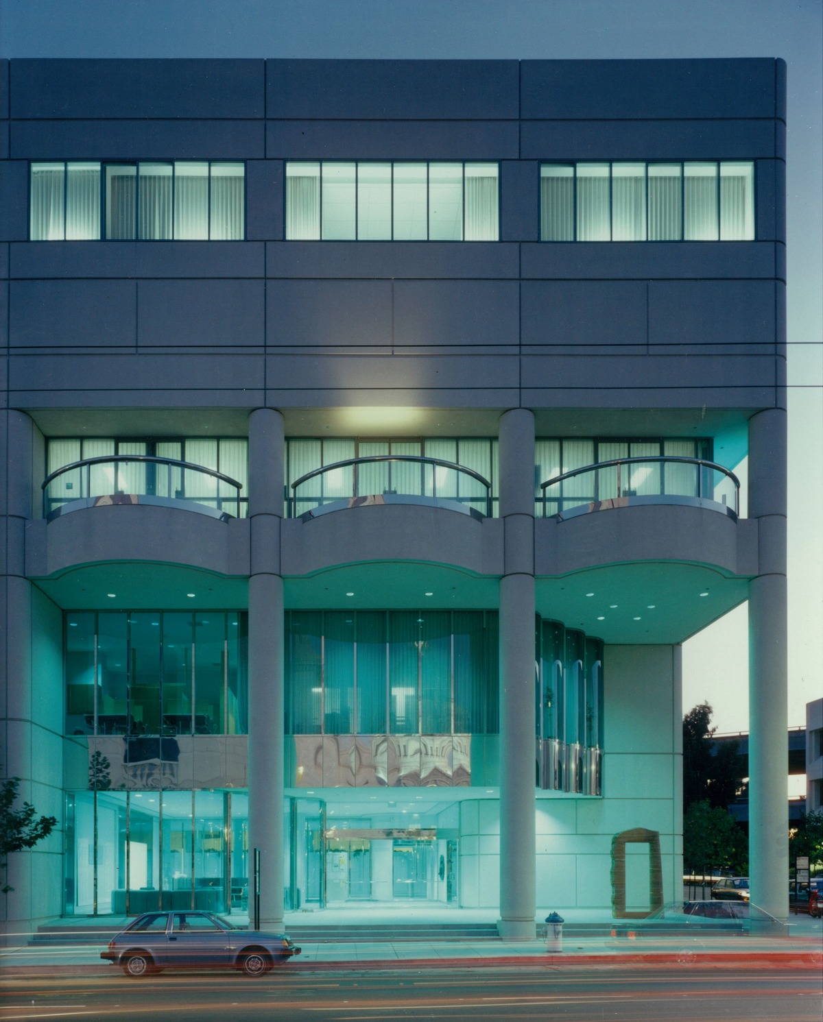
Beverly ann Willis: san Francisco ballet building, 1984
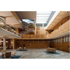
One of the works of Beverly Willis that I really wanted to discuss was this ballet building that she designed. Right of the bat before even looking at the interior of this building you know it is going to encompass a lot of open rooms. For me structurally this is interesting because you can’t have supporting beams everywhere as the purpose of this building is for dance.
I really like the overall outward appearance of the building. To me especially for its time, it is appealing to the eye. I like the use of pillars and that it also incorporates three outdoor spaces. The columns make the building appear larger than it is. I also like the use of windows. I think especially for dance spaces that large windows are important and dancing within a space that encompasses large windows is much more enjoyable considering you have a view and access to natural light. The building when lit up at night has a blue tent to it, from the use of windows and the lighting used.
This building was completed in 1984. Beverly Willis took a lot of time visiting other studios and talking with dancers. She did this so she could truly understand the needs of the space so she could make a space that was adaptable and that could be used for years to come. She talked with the people that would be using this space and took what they said to create a building that fostered and promoted dance, while also creating a building that had fun features. This is also the first building that was constructed solely for the purpose and use of just dance. I think it is important to note the dedication and research that she put into this building and just how much she traveled to gain an understanding of what was needed from this building.
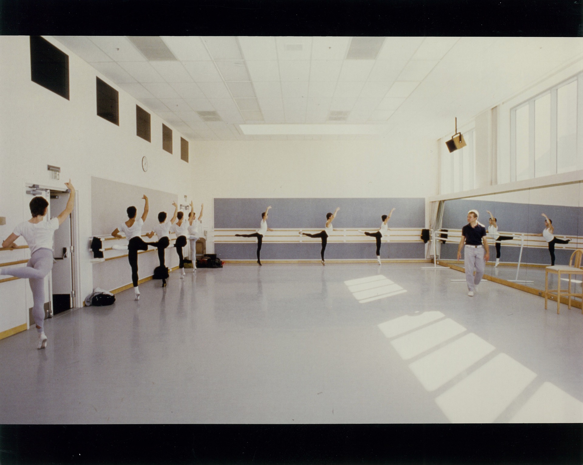
As you can see in the photo above the studio spaces that were built came with high ceilings and large windows. I think the use of and access of natural light and high ceilings really opened up the space, and the addition of the mirror makes the space feel bigger and also allows for better ventilation.
Overall, I find the interior and exterior of this building really cool. The fact that this was the first building constructed solely for a ballet company is really interesting, and I like the features such as metal paneling, large windows, glass doors, and columns on the outside.
Bauhaus Building – Walter Gropius

The construction of the Bauhaus building started in 1925. Walter Gropius was the head architect for this project. Gropius intentionally includes a glass facade surrounding this building in order to show off its interior workings. I really like this approach because the building shows vulnerability and also class. There will be lots of natural light for all sections of this building which is also a huge bonus. Each section of the building was designed separately, separating them for the purposes of the functionality of the structure itself. I really like the inclusion of lots of glass, I think that being able to see nature can be a huge boost for the people working inside.
Le Corbusier 4
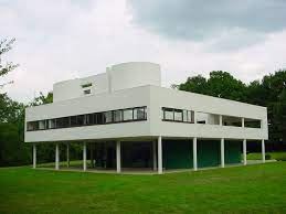
Villa Savoye is a villa built by Le and his cousin Pierre on the outskirts of Paris. The Villa was originally mean to be a weekend home for the Savoye family. And was in a collection of private home white villas that Le designed with him cousin. The clients gave Le few restrictions with this house. The villa is essentially a big square that is lifted off the ground by stilts and covered in windows on every side. The roof is actually a terrace that you can go on and garden. All the living areas are on the upper level while the lower level is for maintenance and service programs. This villa is a key building in the development of the International Style of Modernism. One of my favorite parts of this house is the spiral staircase that comes down with a railing and smooth edges. I like the clean look of all the white and smooth edges. The inside is all white with black metal railings and black decor. I like that this villa is different than the rest that I’ve seen and that it is raised off the ground.
Le Corbusier 3
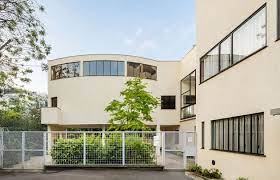
Villa La Roche was a house designed by Le and his cousin Pierre Jeánneret, finished in 1923. The villa was built for a Swiss banker. The whole house follows the idea of an architectural promenade, which was inspired after Le’s trip to the Acropolis in Athens, Greece. An architectural promenade is supposed to feel like an art gallery or an experience as the house leads you with all its soft edges and turns. The villa follows rules of geometry and has a minimalist aesthetic. I like this building a lot, it has a lot of soft curves and points that all flow very nicely together. The inside gives you clear direction of where you should be walking and how you go through it. All the corners and curves are cohesive and run together with purpose.
Le Corbusier 2
Cabanon de Vacances is a vacation home that Le Corbusier built for himself in France in 1951. The cabin was made a world heritage site in 2016. The cabin was built using the Modulor system which was invented by Le and builds using a human scale. This cabin is said to be a simplified version of Le’s views on architecture. Cabanon de Vacances is one of Le’s only projects that is done entirely in wood. The cabin also gave Le direct access to a bar next door, where he knew the owner. Windows in the cabin give you a view of the southwest and east bay from all around the building. The cabin has been described as a cube that revolved around the furniture. There is also little furniture except beds and dressers. The cabin looks like what I would typically think of when I imagine a cabin. It kind of looks like lincoln logs. I don’t love or hate this building, I am surprised at how small it is. I would think that Le would want a bigger vacation home, but then again he’s said that he had an estate and that was for his wife.
Le Corbusier 1
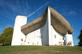
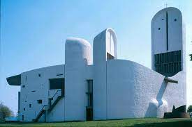
The Colline Notre Dame du Haut is located in France and was built in 1955. The Colline is still a working religious building today and is under guardianship. The Colline was actually built on remains of a chapel that was destroyed by bombs in a war. The church is mainly composed of stone and cement. Daylight is allowed in the church by small openings covered in either clear or colored glass. Corbusier did not like that gothic style of stained glass, so the colored glass in the church is glazed and is still see through. The chapel was the first to use the technique of having panels of sheet steel be enameled in vivid colors at 760 degrees celsius. Along that same wall, there is an intense red that fades into a violet wall. I like this piece of work because it doesn’t look like any chapel I have ever seen. Usually Catholic churches are all done in the same style and it is easy to see a building and know that it is a church, especially if it is Catholic. I like the smooth lines of and roundness of the Colline. Also, the whole building looks cohesive but at the same time the back of the church is not what I thought it would look like.
http://www.fondationlecorbusier.fr/corbuweb/morpheus.aspx?sysId=13&IrisObjectId=5147&sysLanguage=en-en&itemPos=3&itemCount=5&sysParentName=Home&sysParentId=11
Gothenburg Courthouse
The Gothenburg Courthouse was built in 1672 in Gothenburg, Sweden. In 1912 the city court of Gothenburg decided that the courthouse need an expansion added onto it. The city held a design competition that Erik Gunnar Asplund would win. It would not be until 1934 that the city would decide to fully go through with the addition to the courthouse. One unique part of this design is that Asplund had full control over the addition. He had full control over the inter stairs, the chairs in the court, and even the transparent sinks in the bathroom.
One of the things that make this building so unique is that because it was fully designed by Asplund, you can see his style everywhere. Asplund tried his very best to take the corners out of everything, he enjoyed designing buildings that were rounded out. The design of the Gothenburg courthouse might be Asplund’s most personal work. Strictly because he got to design the building in his own way. This design has Erik Gunnar Asplund’s signature written everywhere on it.
Sources: https://www.higab.se/wp-content/uploads/Courthouse_Eng_8maj2017_LOW.pdf https://thearchitecturalsite.tumblr.com/post/158623831114
Stockholm public library
The Stockholm public library was first designed in 1922 and construction to build the library began in 1924. Erik Gunnar Asplund, an architect from Sweden was in charge of designing the building. Asplund’s first design of the building included a dome in the plans. However, the design was forsaken in place of a rotunda. This was also the first public library to institute open shelves. This meant that those who came to the library no longer needed assistance to find the books. Open shelves would later become a commonality among the rest of the world.
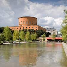
Asplund’s design of the building was very unique. His style of architecture always used space well. The proportional ratios of this building, along with the symmetry make for an equally proportional building that has a relaxing feel to it.
Source: https://en.wikipedia.org/wiki/Stockholm_Public_Library
Vitra
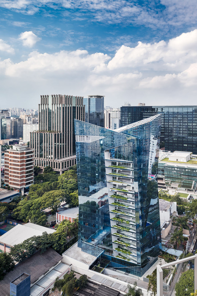
The Vitra building is a sustainable high-rise residential project located in the Itiam Bibi district of São Paulo. It was completed in 2015 with luxurious finishes. This building has fourteen floors from residential to penthouses. Vitra was designed by the architect Daniel Libeskind and developed by JHSF, Brazil’s leading real estate development firm. This was Libeskind’s first project in South America.
“The inspiration for the project is the city of São Paulo and the Brazilian people. I designed this tower to expresses the optimism, vibrant culture and dynamic possibilities of a truly pluralist people,” said architect Daniel Libeskind.
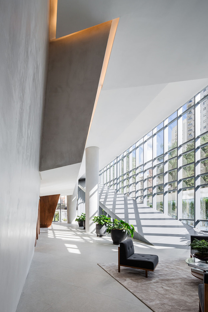
The entire interior features the combination of concrete and warm woods. The interior designer was Dado Castello Branco.
I was drawn to this building for the crystalline form and glass exterior. It definitely creates attention and stands out from the rest of the city. After reading more, I was intrigued with the sustainability aspects such as the rainwater collection system. The translation of the exterior angles and sharp, clean lines into the interior spaces and concept are amazing to me. It is definitely a place I want to visit to view the interior if I ever have the chance.