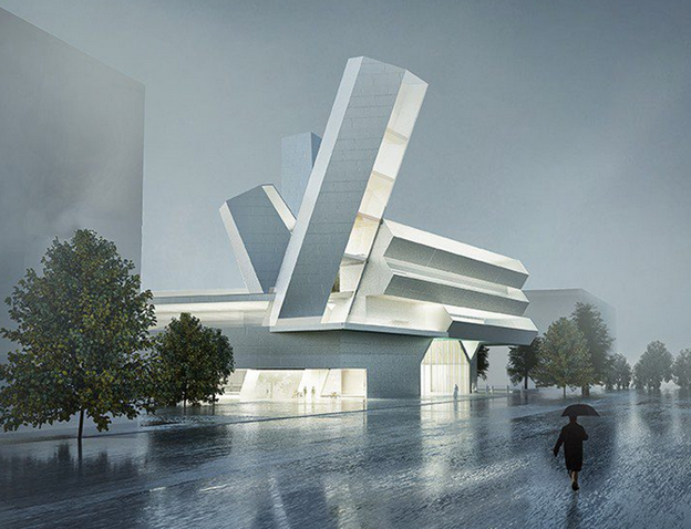
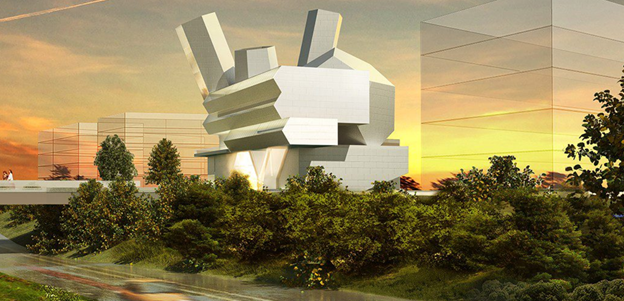
Steven Holl designed this Centre for Creativity for University College Dublin (UCD) It includes studios, lecture halls, exhibition space, forum space, a foyer, a café, and an observation center. This building was designed around five different concepts: Place, Space, Gateway, Natural light, and Circuit of social connection.
The Centre for Creative Design and the entry plaza with its reflecting pool represent the New Campus arrival experience for UCD students. Its inspired by the geometries of the Giant’s Causeway and the work of James Joyce. It was designed as a space to link everyone in a free and open way for creative collaboration.
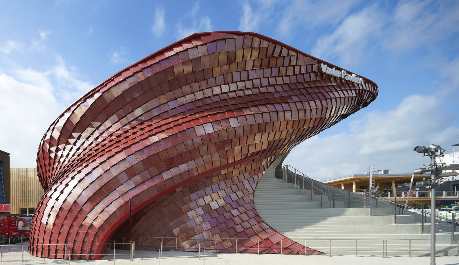
The Vanke Pavilion was a part of the Milan Expo 2015 that was located in Milano, Italy. The expo theme was “Feeding the Planet, Energy for Life.” The Vanke Pavilion was a collaborative effort which consisted of the architect Daniel Libeskind, the interior exhibition design led by Ralph Appelbaum Associates, and graphic design by Han Jiaying.
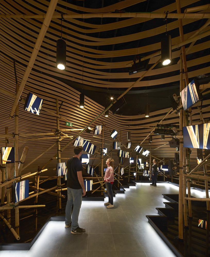
Interior exhibition design led by Ralph Appelbaum Associates.
The concept of the Vanke Pavilion integrates three ideas drawn from Chinese culture related to food. The ideas included the shi-tang, a traditional Chinese dining hall; the landscape, the fundamental element to life; and the dragon, which is metaphorically related to farming and sustenance.
The architect on this building was Daniel Libeskind. Daniel Libeskind is a world-renowned architect from Poland. His international reputation solidified in 1989 when he won a competition to build an addition to the Berlin Museum. This later housed the city museum’s collection of related to the Jewish history.
The building caught my eye due to its organic shape and interesting exterior material. The building itself looks like a piece of art on display and not a building that you could walk through. When I went through the images on ArchDaily, I was surprised to see the interior. I was not expecting an art exhibition type display. After reading more about the building and its concept, I could visually see the three ideas of the concept within the building.
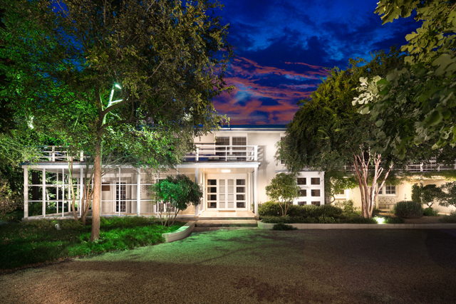
O’Neil Ford seems to have a pattern with his architectural work. All of his buildings hold up in todays world, and I am sure they were looked at odd when they were first made. This house, the Alfred and Juanita Bromberg House, looks very similar to what modern houses look like today. The use of white, and the various windows all help this house have a modern appeal.
There is one thing though that tells me this house was designed in 1939. That is the flat wide layout. A trend amongst older Dallas houses, is to have a flat wide layout. It was done a lot in the 50’s, however in todays age we are going up in height and not in width. That most likely has to do with drastic change in our population. I do enjoy the older spacious houses, but there is nothing better that saying you live in a three story home.
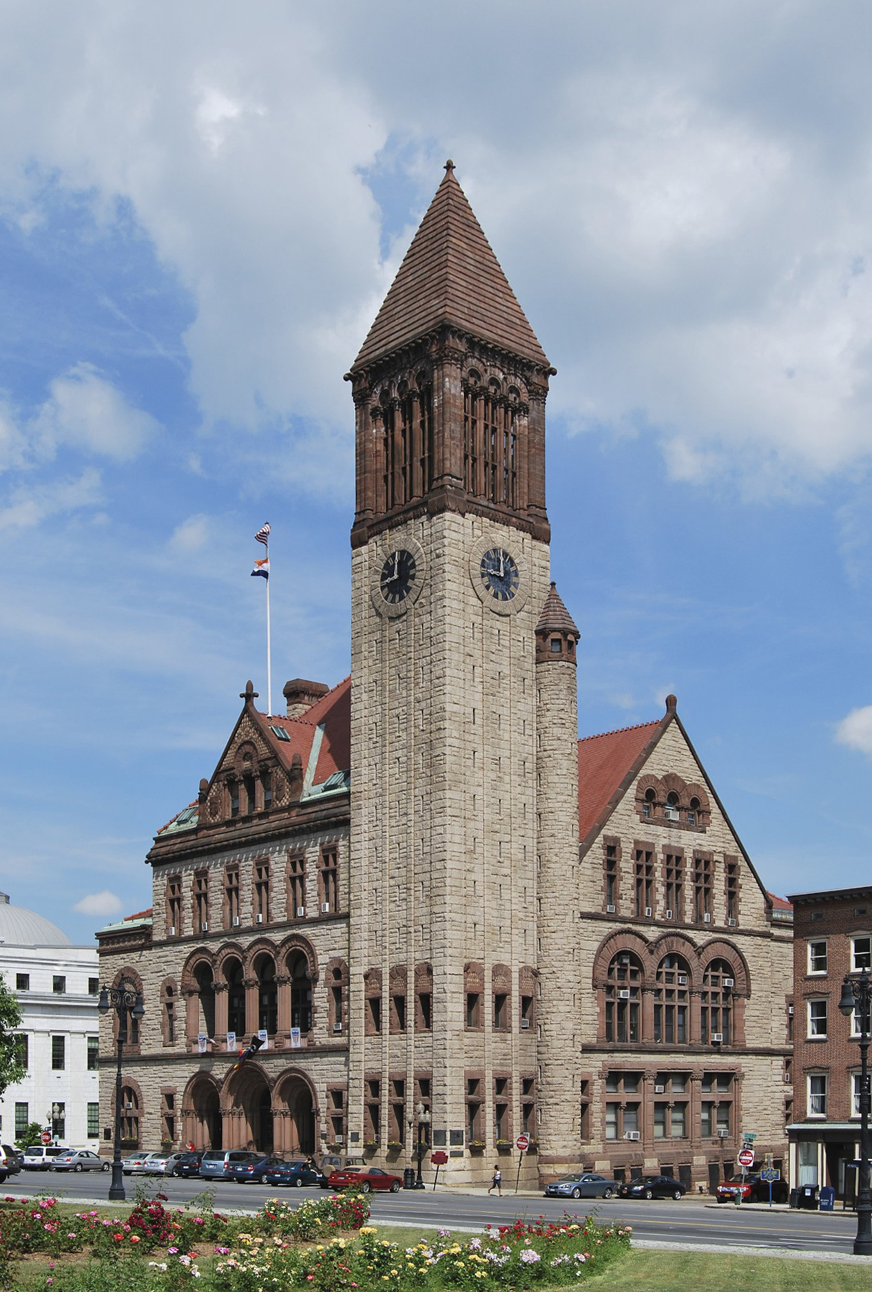
Albany City Hall, Albany, NY. Hopefully, this one doesn’t burn down.
In 1880 a fire destroyed the city hall in Albany, New York. In the ashes of the old building, Henry Hobson Richardson would this time construct a bigger one, one which emulated his Romanesque style, and one that the city of Albany could be proud of, and so he did. Richardson, who was also working on the New York State capitol at the time, secured the commission for the replacement for the city hall after competing against five other architectural firms. The building was built between 1880 to 1883. It is without a doubt one of Richardsons most Romanesque designs with banded arches, a large tower placed on the corner, rhythmic fenestration, and bold use of materials. The building is laid out in a simple rectangle formation. The building is three-and-a-half stories tall. Besides the asymmetrical tower placement, the building is rather simple in its design. Its exterior is made of granite and features a brownstone trim. It features arched windows on the first and second floors. The roofs are redbrick red and are peaked in a traditional gothic style. The interior is also simplistic but still magnificent. Richarson, lacking funds, decided to spend most of his efforts on the exterior, hoping that feature architects would finish the interior space. The city finished the interior roughly thirty years after Richardson finished it. The building, in all its glory, is a great example of Richardsons Romanesque style.
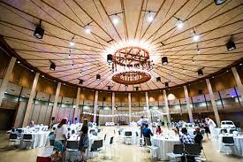
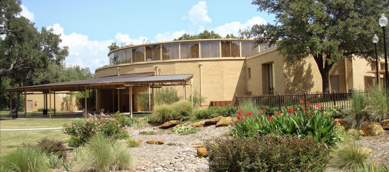
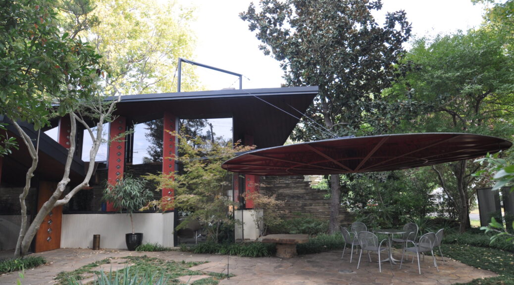
The Denton TX Civic Center was built in 1966, it is used for weddings, gatherings, and other celebrations. Although it was built more than half a century ago, it still holds up to be a fairly modern building. The inside and outside both hold up as being up to date, because they both personally have a complex structure. Most buildings back in the day were built just to be built, however this civic center was built to look well made, and it is.
Many buildings of the past were not carefully drawn put, and were more or less cookie cutter buildings. However, the civic center was far from that. It includes modern design ideas, like the use of nature, an over hang to collect shade, and a glass perimeter at the top of the building to let in natural light. This building is a good example for what a unique building should be. I have not seen a lot of buildings like this, and I hope to see more soon.
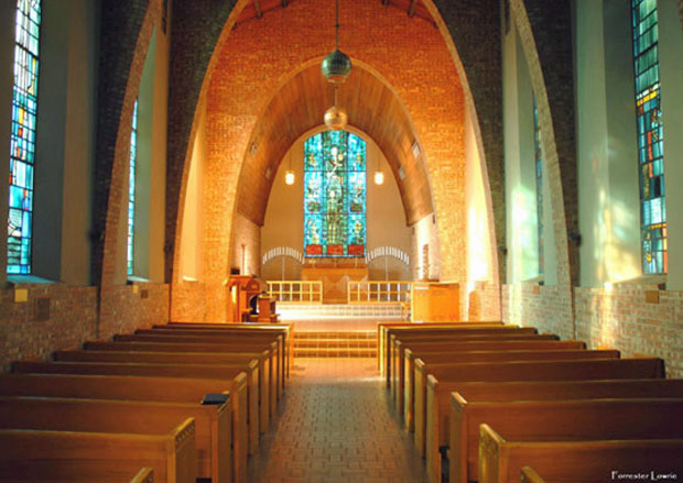
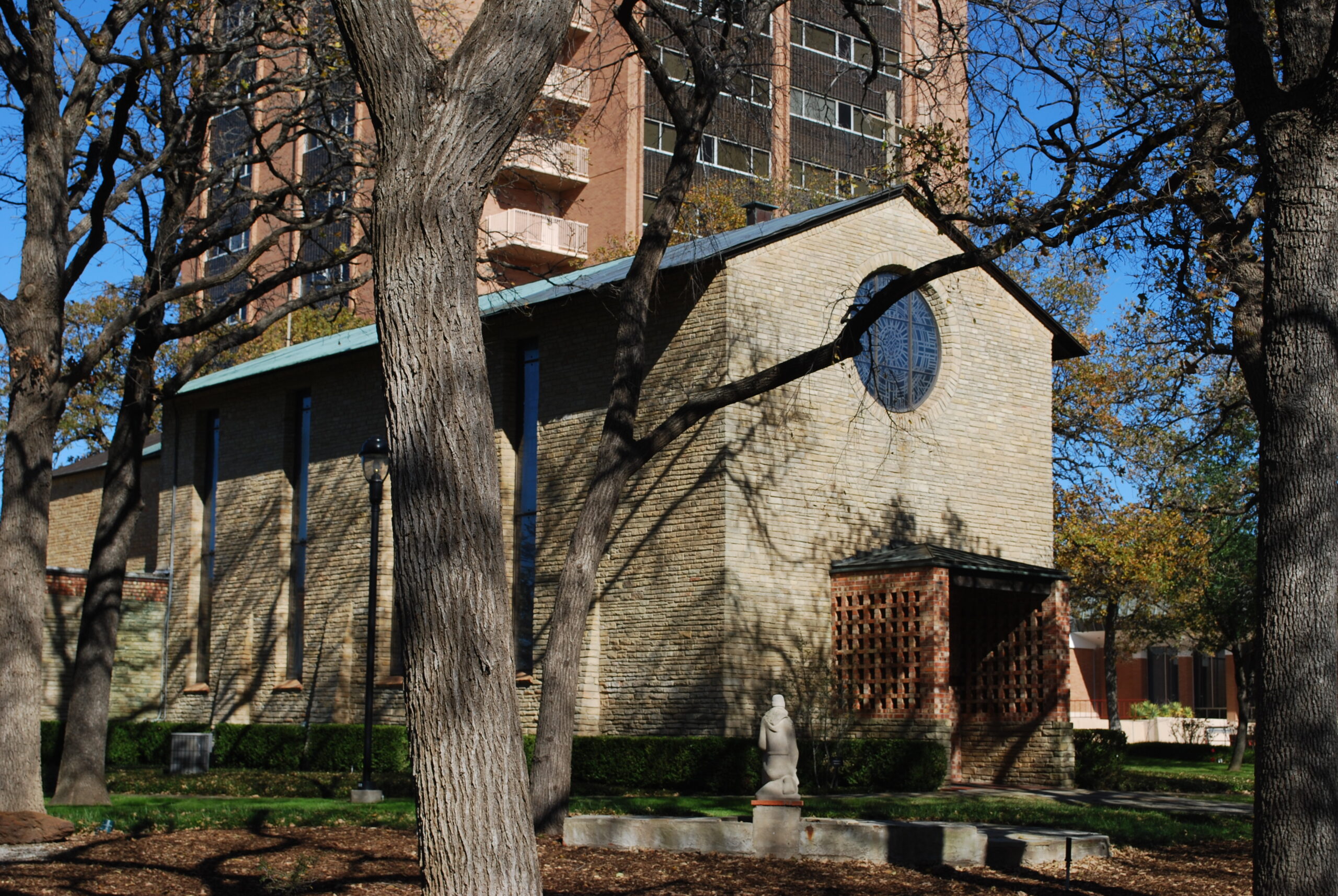
Located in Denton this chapel was built during the great depression, and it looks the part. The inside of the building is the only thing I find enjoyable, and the outside looks like it doesn’t want anyone to look at it. I am sure that during the time, it was an impressive building, especially during the great depression, however, its simplicity makes it forgetful.
I do however enjoy the stained glass, and after doing further research, local students in the Denton area helped design some of the glass frames. I believe the glass is not too complex to where the viewer does not know what they are looking at and not too simple to glance over quickly with no care. The inside is a pleasant surprise compared to the outside.
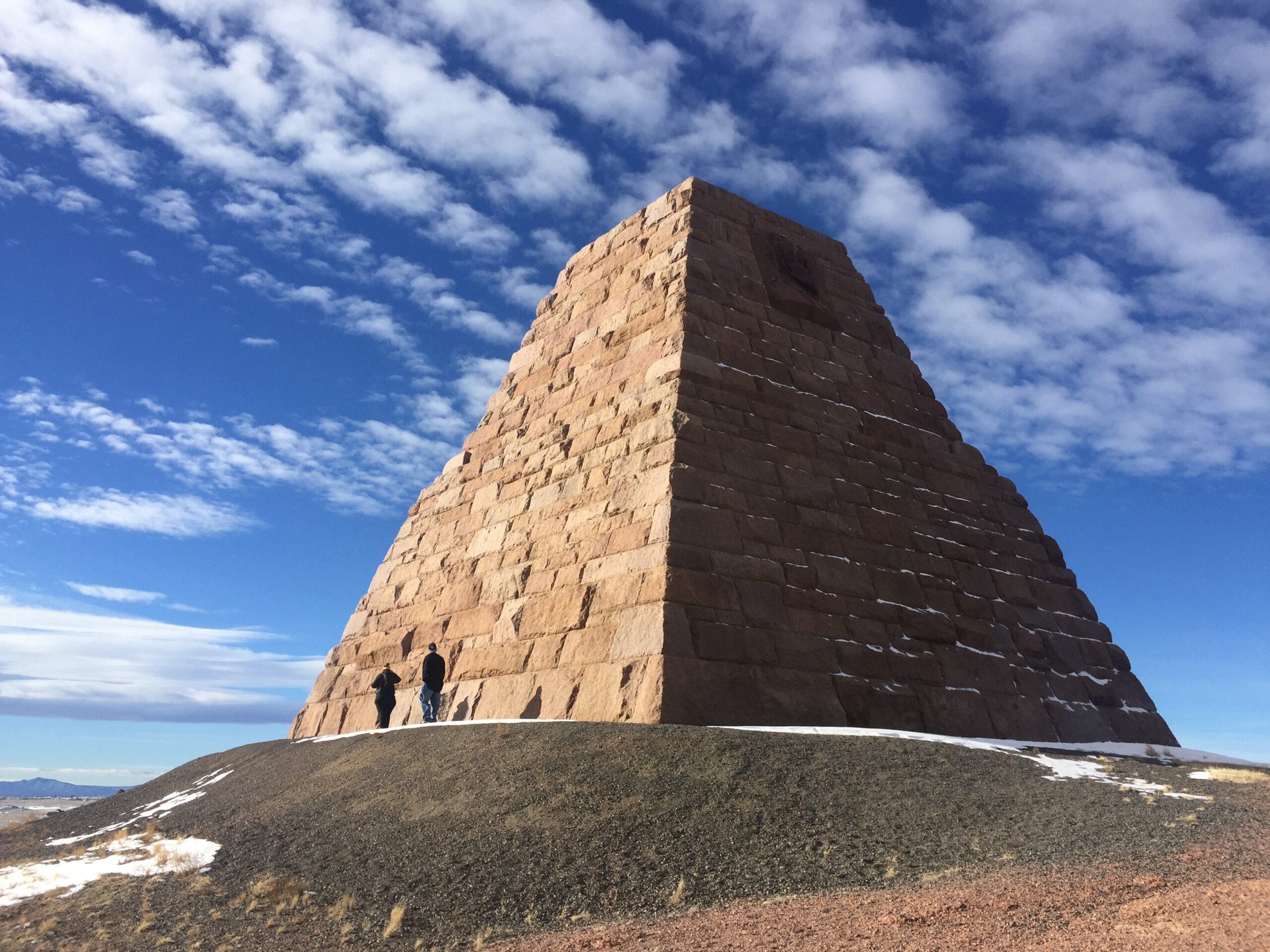
The Ames Monument is a pyramid in Albany County, Wyoming, designed by Henry Hobson Richardson. The monument was constructed from 1880 to 1882 and was dedicated to the brothers Oakes Ames and Oliver Ames, Jr., two financiers of the Union Pacific Railroad. The monument marked the highest point on the First Transcontinental Railroad, at 8,247 feet. The monument is a four-sided pyramid constructed from ashlar stones made of light-colored native granite. The pyramid has a 60 feet square base and stands 60 feet high. The pyramid also features an interior passage that has now been sealed. On the east and west sides of the pyramid, there are sculptors of the brothers close to the top. The top quickly finishes in a shallower pyramid shape. Through his design, Richarson created a modern monument that looks as if it could have been from time antiquity. It is a fitting monument to be dedicated to the roughness and willpower that was required to build the Transcontinental railroad.
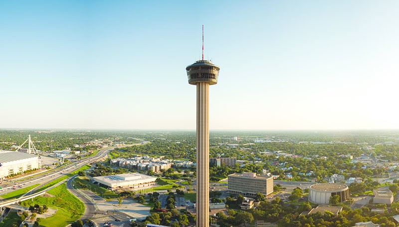
This tower was built in 1968 by O’Neil Ford, it was built in celebration of San Antonio’s 250th anniversary. There is a restaurant at the top of the tower and a viewing ledge to view the city from a height of 579 feet. Although the Seattle Space Needle was built prior to the Tower of the Americas, the Tower was still one of the first of it’s kind. The Dallas Reunion Tower followed the trend 3 years after the San Antonio Tower.
When I first visited San Antonio, I dismissed this tower as a copy of my hometown tower, the Reunion Ball, how wrong I was. The Tower of the Americas is by far the most impressive, because unlike other cities towers, the tower is a straight needle. The Seattle and Dallas towers both use complex designs to hold their top area up, however the San Antonio tower only needs a straight cylinder.
While the name may not sound familiar, the Ledbetter House designed by Bruce Goff is one that we all know well. Located right down W Brooks St. behind the McFarlin Methodist Church sits the Ledbetter House: one of the most impressive and successful pieces of architecture in Norman, OK history. Initially designed and built for oil-guru H.E. Ledbetter, the house is now owned by the University of Oklahoma. The house features Goff’s take on what modern architecture is supposed to be: unconventional, shocking, and speechless. When the house reached its completion in 1948, it drew in a crowd of 14,000 visitors to tour the home before anyone was allowed to move in. Features of the home such as a large ramp instead of a staircase, corrugated aluminum panels, and water drips in stone walls (among many other details) bewildered the Norman community of what modern architecture meant.
While the house was designed for Ledbetter, he never actually resided in the home because of the cost to build it. So, for the sake of keeping the home alive, the American Legion group and Alpha Gamma Delta sorority raised money to preserve its beauty. The home was eventually bought by the university and added to the National Register in 1999.
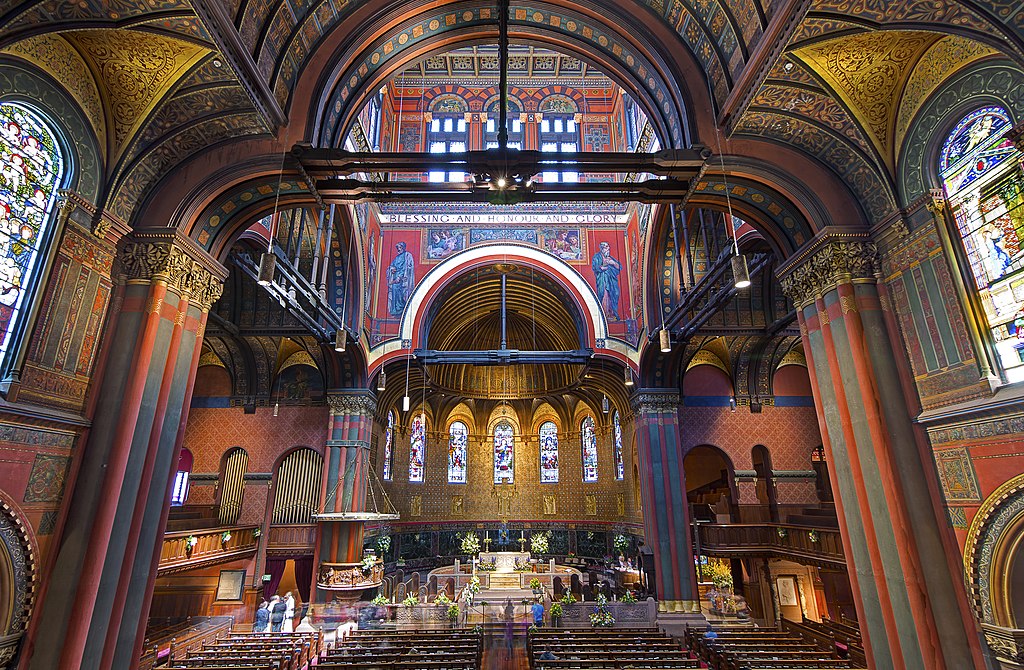
“Blessing and honour and glory,” – Trinity Chruch.
The Trinity Church was constructed from 1872 to1877 in Boston, Massachusetts, and was designed by Henry Hobson Richardson. The church is the only church in the United States that has been honored as one of the “Ten Most Significant Buildings in the United States.” The church is built in a classical cross structure with four arms extending outwards from the central tower. The base was built atop of Boston’s Back Bay, which was originally a mudflat. Because of this, Trinity rests on some 4,500 wooden piles which have been driven through 30 feet of gravel fill, silt, and clay. The outside of Trinity is built into three separate layers which lead into the tower in the center. The bottom level is decorated in columns that hold up the front facade. The second level features two towers that are constructed in a gothic style much like the central tower on the third level. The interior is large, wooden, and colorful with murals covering over 21,500 square feet along the inner walls. Light falls into the center of the church from windows in the central tower. The apse in typical fashion is built into a semicircular recess and covered in a hemispherical vault. The wall of the apse is decorated in gold and holds several pieces of stained glass.
Warning: Attempt to read property "comment_ID" on null in /home/thedudeo/fall2021.thedude.oucreate.com/wp-content/plugins/subscribe-to-comments/subscribe-to-comments.php on line 71
Warning: Attempt to read property "comment_author_email" on null in /home/thedudeo/fall2021.thedude.oucreate.com/wp-content/plugins/subscribe-to-comments/subscribe-to-comments.php on line 591
Warning: Attempt to read property "comment_post_ID" on null in /home/thedudeo/fall2021.thedude.oucreate.com/wp-content/plugins/subscribe-to-comments/subscribe-to-comments.php on line 592